Ben Laurence
·
·
6 min

TL;DR
It depends where the problem is. Start with what you think isn't working, then look around it. Can it be fixed on one page, or does it run across several? Look wider: if the site itself is holding you back, or causing more problems than it solves, you often need a full redesign.
Everyone hopes it's the small job
Take your car to the shop and you're hoping for one thing. A loose part. An hour's labor. Not the engine.
It's human nature to want big things fixed in the smallest way possible. Websites are no different. Rebuilding can be a complicated decision, and quotes can be wildly different depending on who you ask, what they've decided before they've looked, and what platform you're on.
Sometimes it really is a quick fix. Sometimes you have to pay for the bigger job. Either way, everybody wants the same thing in the end: the car running smoothly and the website making money.
Putting off the inevitable
We know the feeling from the other side of the counter.
Our site served us well for a time but it sat on a platform that had become restrictive.
It's a notorious agency problem. You spend so much time on other people's websites that your own waits. There's always a client project that matters more. For a long time, rebuilding just didn't make sense.
Then we outgrew it. We couldn't get the things on the site that people needed to see. No patch fixes a platform that can't do the job. So we took it seriously, invested the time and started again, betting it pays back the way it does for our clients.
You're reading the result.
Start where you're pointing
Most owners come to us pointing at something: the form, the product page, the checkout. That's where we start. Then we step back and ask whether fixing it will actually make a difference.
Not every job needs that. Give us a specific job on a tight deadline and we'll get it done. We're not there to go looking for problems. But we're consultants by nature, so if we spot something that could hold you back later, we'll tell you.
Most people, though, don't come to us for the fun of redesigning a website. They come because they want it to make more money, bring in more leads, win more business. So we follow the path your buyers take to the sale. If they check you out before they commit and your About page lets them down, that's part of the problem too.
We're not redesigning pages just to make them nicer. We're here to make the business money.
Where people leave isn't always why
Where people leave your site tells you where to look. It doesn't always tell you why.
Someone who quits at checkout may have found a shipping cost the product page should have mentioned. In Baymard Institute's survey of US online shoppers, extra costs like shipping, tax and fees were the top reason for abandoning a checkout, cited by 40% of those who weren't just browsing. Another 12% said they couldn't see the total cost up front.
Someone who abandons your form may never have been convinced by the pages before it.
Your form could be the best thing on the internet since "Charlie bit my finger." But if nobody's clicking through to it, we have a problem no amount of work on that page will fix.
The drop shows up at the end. The cause can sit earlier. And owners are often too close to their own site to see it.
Bigger than one page
Case in point. BillieBars make truck bed racks, and they asked us to improve a product page.
The store had been set up the simple way: a separate product page for every fit. It looked tidy, but it wasn't how people shopped. Visitors landed on a page for one truck and were asked for details before anything told them what the rack was. It was confusing.
So we looked at how people were actually arriving, and the choices they had to make. Then we restructured. A new product page sits over the top: it introduces the bars, shows why they're worth having, then walks people to the right make, model and rack. The page for each exact fit sits underneath, with the same look.
Product page conversion went up 52%, from 0.65% to 0.99%.
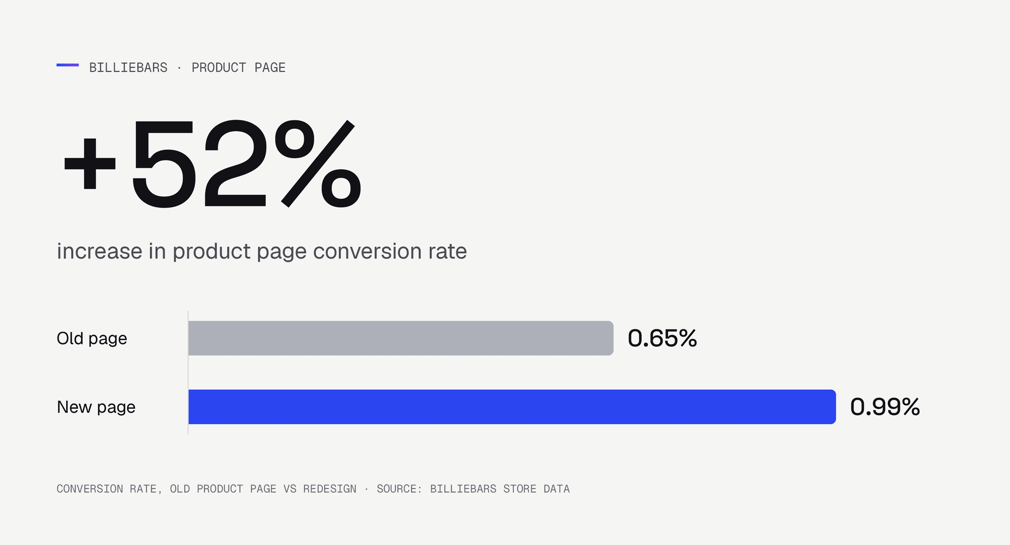
It wasn't a teardown. It wasn't one page fixed on its own either. A page can be part of a problem that runs across three, and then all three need looking at. We didn't redo the website. We fixed the whole problem.
When the answer is less
Another client, Big Hammer Wines, came to us with a huge site and an open question. We want to improve conversion. What should we do?
We could have told them to redo the whole site. Some pages may need it one day. But it wasn't the right call then. Better to see what the high-traffic pages could do first.
The site was on Shopify, a strong platform, and it was put together well. What it lacked was content in places.
So we focused on the two high-impact templates: the homepage and the product page. Change the product page template once and you've changed every product on the site. Between them, those two pages are where most visitors arrive.
What sets Big Hammer apart is its founder. He tastes more than 5,000 wines a year, and only about 4% make the cut. Most of that sat on the About page.
So we brought it forward. The homepage used to open on a stock photo of a couple picnicking in a vineyard. Now it leads with one wine and a personal recommendation, then introduces the founder.
The product page had its own problems. The old one gave you the price and the button first, and a heavy text block. The new one opens with a one-line verdict on the wine, puts the reasons to buy above the button, and keeps the case saving and the guarantee right beside it.
It wasn't a straight redo. It was a restructure, and it covered a lot of what we saw wrong across the wider site in just two templates.
It worked, and they've kept every change since.
So which do you need?
A few fixes
The site sells, people get most of the way, and one part is failing. Lots of people start the form, few send it. Full carts, few orders.
Find out why, then fix it with a contained change. That's one to audit, and a job for conversion rate optimization, not a rebuild.
The pages people buy through
Several steps on the way to buying lose people, or the reason they leave sits a page or two earlier. Redo those pages together. You don't have to redo everything. You do need to redo enough for the change to show.
A full redesign
Sometimes it's painfully obvious. You'll know. The homepage says the wrong things, and there's no clarity and no trust.
Can you change a price or add a product without calling a developer? Can Google even find your pages? Does the site work properly on your own phone? If not, the platform is holding you back.
When that's your site, stop patching. Burn it to the ground and salt the earth. A refresh won't do it either: a new look on the same site won't sell better.
Starting over isn't the slog it used to be. With the way the industry has moved, a rebuild can be live in weeks, not months: for a typical Shopify store, the design and UX work on every page takes two to three weeks. That's when a website redesign is the better spend. We should know.
What to do next
Start with the page you think is the problem, then look at what people saw before they reached it.
Count every page that touches the sale, not just the one you think is broken.
If it's painfully obvious the whole site has to go, stop patching and start again.
Ben Laurence
Founder of Edge Gen. 20 years designing websites that have to sell. Startups, global brands, plenty in between. Writes about what moves the numbers, and what doesn't.