Beuta case study


Designing clarity for a complex ecommerce product.
Beuta is a modular garden brand with years of strong performance, great reviews and a product that genuinely delivers. The old site wasn't keeping pace. A Project Builder that wasn't converting. A structure that confused first-time buyers and generated wrong orders. And a UI that looked like the starting point, not the destination. We rebuilt from the ground up: clarified the brand, fixed the structural issues costing them customers, and turned a good product into a site experience that matches its ambition.
What changed after the relaunch.
website revenue growth
product page conversion rate
add-to-cart rate
revenue per visit


Audit first. Then structure. Then every template.
We started with a full audit of the old site. Four problems stood out: Buyers didn't fully understand the product. The site listed the range but didn't sell it. People were ordering the wrong items. Every journey was pushed to the Project Builder, ready or not. To close those gaps, we defined three buyer types (novice gardeners, experienced DIY shoppers and returning customers) and built a simpler sitemap around how each one decides. Once the buyer types and structure were signed off, we moved into fully annotated UX wireframes for every store template, with the conversion reasoning written into each one.


Product page rebuilt
Drag to compare

 BeforeAfter
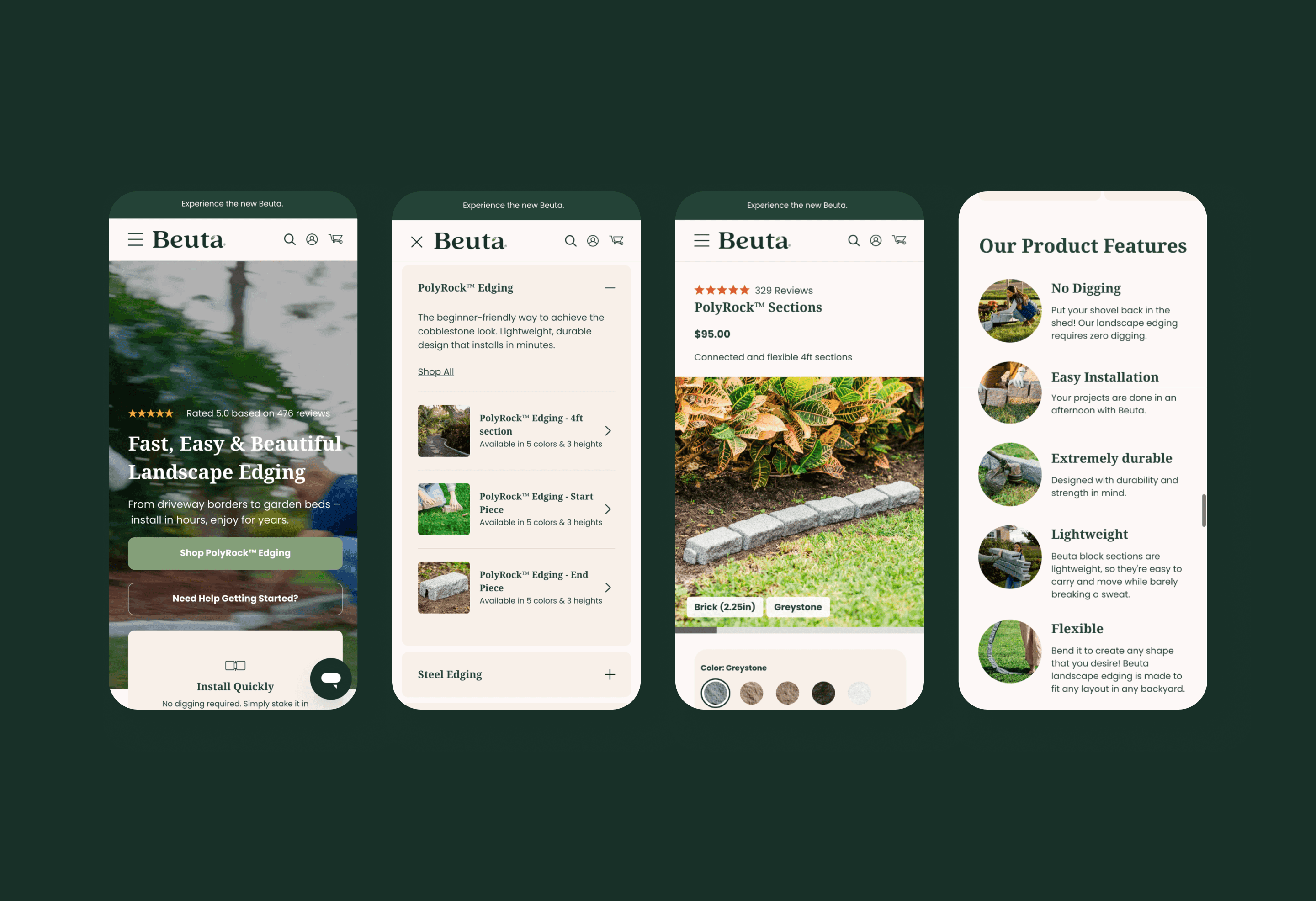
Features built to answer doubts.
• Before/after transformation slider We treated it as a conversion asset, not decoration. For a landscaping product, the real question is "what will my garden actually look like?" A drag of the slider answers it faster, and more convincingly, than any product photo. • Mega menu that sells on hover Product previews, availability and a direct route to purchase all show before a single click. Shoppers who arrive through it land on the product already knowing what they want. • Install help on the product page Every product page answers "how hard is this to install?" without sending anyone away. DIY Hacks & Tips videos sit on the page, and a "Watch how to install" prompt sits in the image gallery, at the moment a buyer is looking closely.


Ben handled the UX, design, and project builder, and really took the time to understand what we wanted. The final result came out exactly as we hoped: clean, intuitive, and high-performing.

Kyle Yeager
Digital Director, Beuta
What this delivered.
The site now balances education and conversion. First-time buyers understand what they need; experienced customers move straight to purchase. Restructured navigation, simpler decision points and support built into the buying journey reduce friction and ordering errors, and the system scales as the range grows. It supports several buying mindsets in one cohesive site, a stronger foundation for ongoing testing and growth.
Next case