Jacobs case study: +56% organic search click-through rate


Enterprise redesign for one of the world’s largest engineering consultancies.
Jacobs is a $12B engineering and consulting firm with 43,000+ people delivering infrastructure, manufacturing and environmental projects worldwide. The old site didn’t show that scale. It was text-heavy and dated. Traffic was high, enquiries were minimal. A redesign was under way, but the UX phase had stalled. We came in mid-project to reset direction, unblock delivery and own the interface: a tighter UX and a UI system the Jacobs team could ship with confidence.
What changed after the relaunch.
organic search click-through rate
desktop organic click-through rate
ChatGPT referral traffic, initial lift
Two sets of masters. Neither could win at the other’s expense.
Inside Jacobs, every industry, service and region wanted prominence. Outside, four audiences land on the same pages: prospective clients, investors, press and job seekers. The job was one hierarchy that served all of them, a system the team could extend to thousands of pages, and a first visit that shows the firm’s full scale without overwhelming anyone.


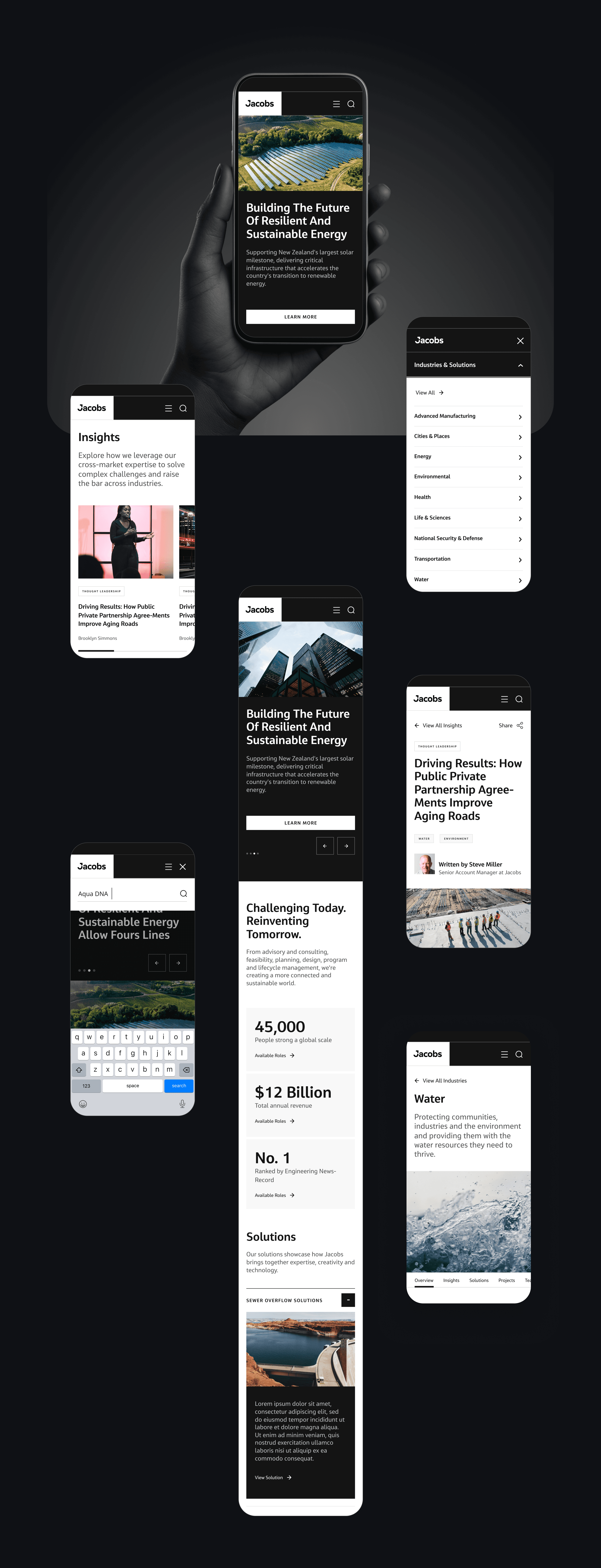
A structure that scales by category, not by stakeholder.
The problem was as political as it was structural. Every sector needed a fair route without the homepage collapsing under everyone’s demands. A mega menu exposes the full industries and solutions taxonomy on demand. Modular content patterns let new industries and services slot in without a redesign. Region, industry and status tags keep a growing library of projects and insights easy to navigate.

Scale up front. The work first, then the explanation.
The UI had two jobs: signal a $12B firm, and stay consistent in the hands of a large internal team for years. A high-contrast bar with headcount, revenue and ranking sits before the first scroll. Editorial imagery turns a text archive into a showcase. Labelled entry modules (Solutions, Projects, News, Insights, Careers) let each audience pick its own route from one homepage.
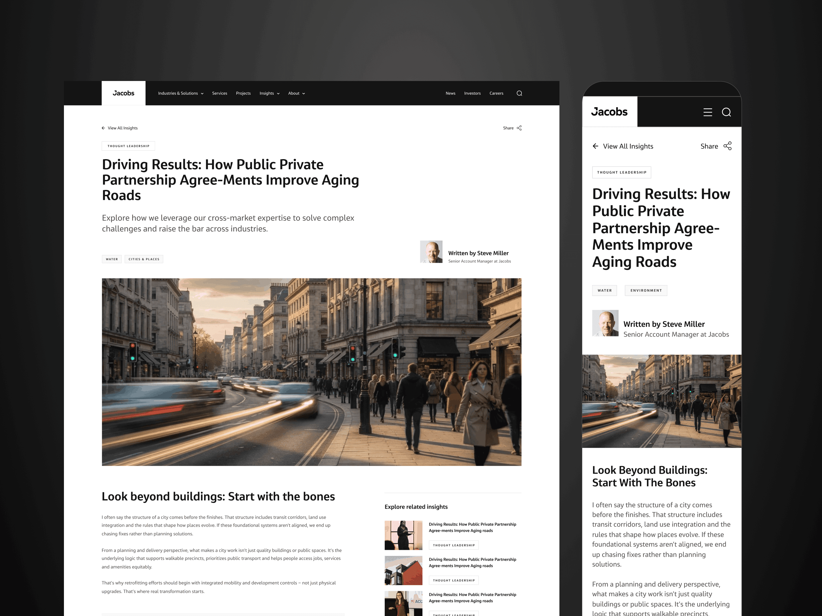


Same depth of content. Oriented in seconds.
The old homepage was a light-grey wall of small type and thumbnails. High traffic, no clear way in. The rebuild trades density for hierarchy: a full-bleed hero, a high-contrast credibility bar and large editorial project cards.
Homepage, before and after.
Drag to compare
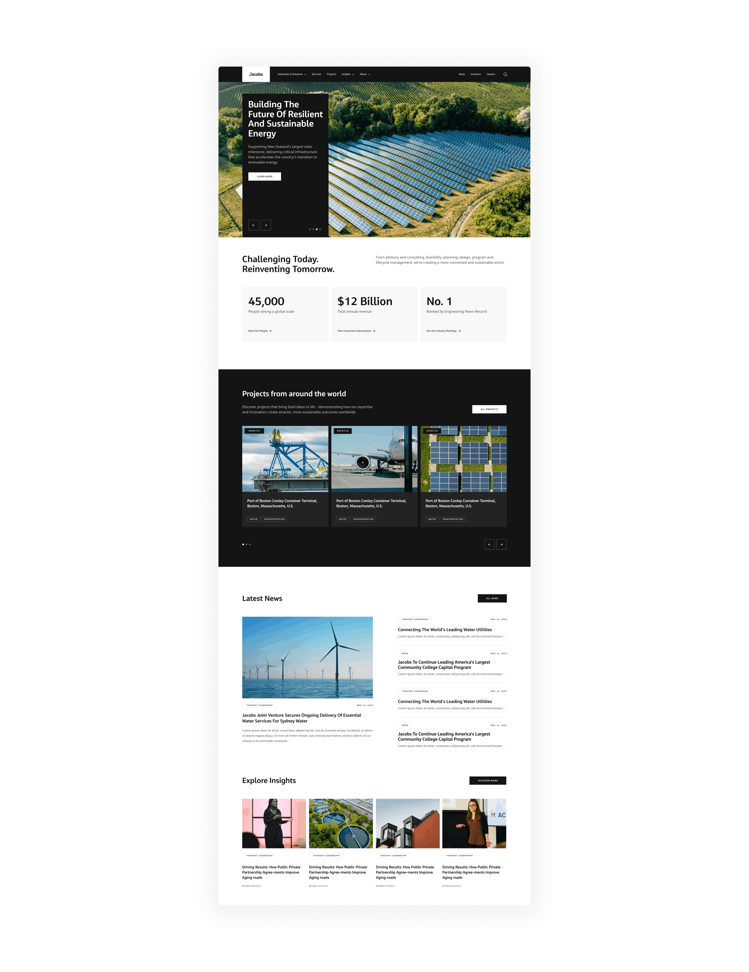
 BeforeAfter
What this delivered.
A stalled redesign, unblocked and shipped, with a UX direction the business agreed on. The UI system is built into Drupal, so the Jacobs team builds and maintains thousands of pages without a designer signing off every change. The structure has held as the business grew. It now carries more industries, nested solutions and a dedicated digital and AI offering.
Next case



