Duolab case study


Making a complex beauty product easy to buy.
A Geneva skincare brand with a device-and-pod system: a countertop unit that mixes one fresh dose at the point of use. Every cream degrades from the moment it's mixed in a factory. This one doesn't mix until the customer does. Online, it read as B2B lab equipment, not beauty. A month after launch, no meaningful sales.
What changed after launch.
more conversions after launch
rebuilt and live

What our audit found.
We audited the live site page by page, as a cold visitor would. • Spec-sheet framing where a beauty buyer expects benefit and result. • Cold traffic landed on pod pages with a price and add-to-cart. Nothing said a device came first. • Pages assumed the visitor already owned the system. • No social proof, no objection handling, no clarity. The problem was structural. A better-looking version of the same site would have failed the same way. So we rebuilt the commercial model first.
A struggling Shopify homepage, rebuilt to sell.
1. A benefit-led headline replaced the vague one, so visitors see what they get straight away. 2. A looping video shows how the system works, replacing the old 3D render. 3. Clear hero CTAs, with the product range moved up to the second scroll. 4. Real people using the product. The old site had none. 5. Google reviews as social proof, placed once visitors understand the product.


Structure follows the commercial model.
We rebuilt from the sitemap up, through five versions, before writing a page spec. • A Starter Kit page sells the system to cold traffic. • A pods page lets owners reorder in three clicks, without being sold the device again. • The homepage gives new and returning visitors their own marked route. • A cart check stops a second device shipping to someone who already owns one.

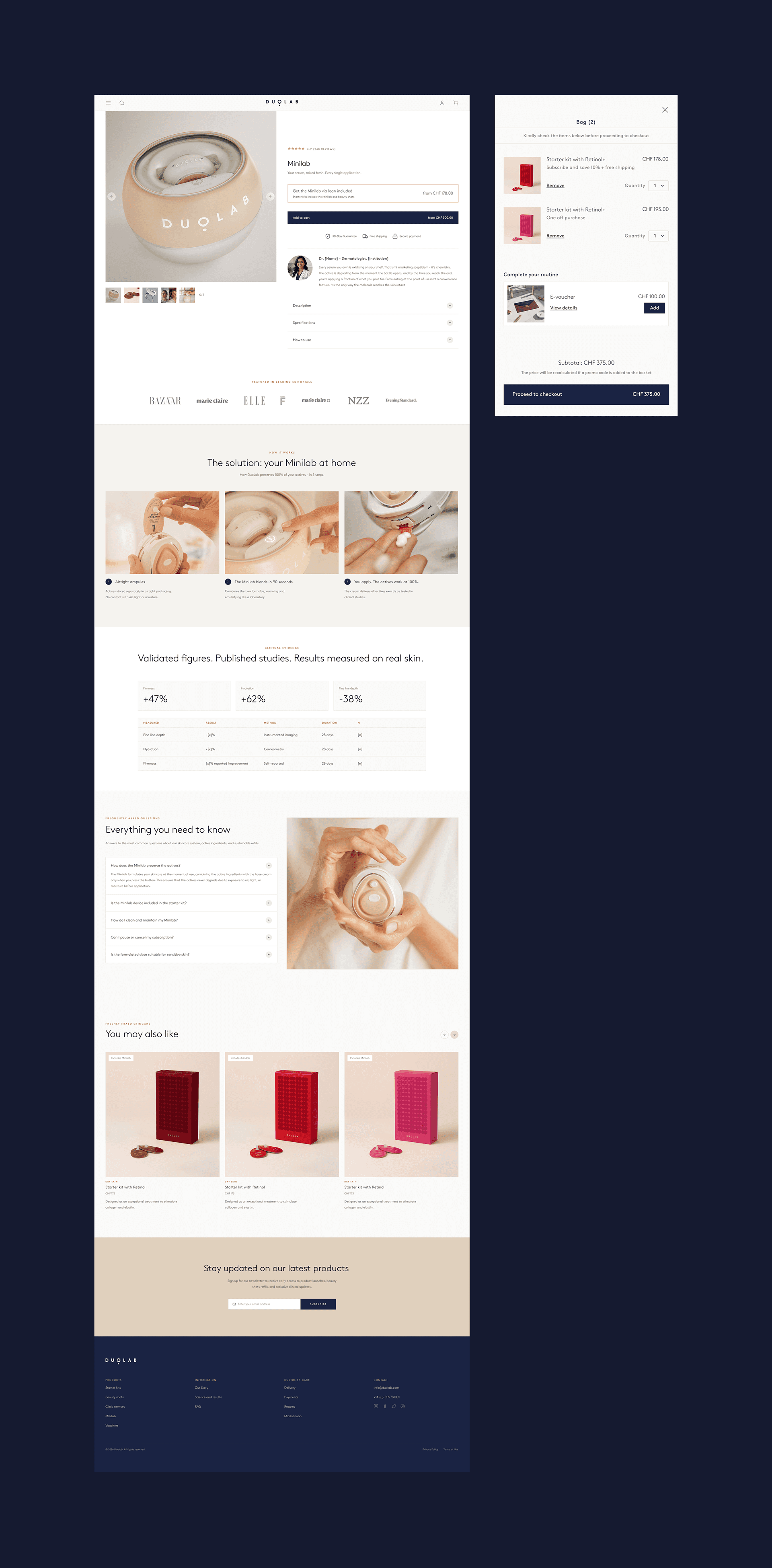
A product page that explains the system.
The old page was a standard Shopify add-to-cart. Visitors couldn't tell how the system worked, and nothing persuaded them it was worth it. It needed to sell the benefits, explain the refills, and make the subscription feel like part of the purchase, not an add-on. We added outcome tags, reassurance next to add-to-cart (free shipping, guarantees), a "what's in the box" section, expert advice, customer reviews and FAQs.



What this delivered.
A site that sells, informs and sets up a higher, recurring order value. The brand reads as premium skincare. Cold visitors recognise the category in seconds, and the price holds up against the shelf. First-time buyers land on the system, not a single refill, so the first order is bigger. Owners get a fast reorder path with a subscription that matches how they use the product.
Ben has the ability to decode your needs and deeply understands the digital environment and customer behaviour, which is magical for people who aren't savvy in this area. He took great pride in the quality of his work and supported us until the very end to make sure the implementation was done to the highest standard."

Anna Bory
CEO - Duolab
Next case