Enterprise redesign for one of the world’s largest engineering consultancies
Jacobs is a $12B global engineering and consulting firm with 43,000+ employees delivering complex infrastructure, manufacturing and environmental projects worldwide.
Their existing website didn’t reflect that scale.
It was text-heavy and outdated. Traffic was high but enquiries were minimal.
A redesign had already begun, but the UX phase had slowed and momentum had stalled.
I was brought in mid-project to reset direction, unblock delivery and take ownership of the interface. My focus was tightening the UX, and producing a complete, implementation-ready UI system the Jacobs team could ship with confidence.
My role
CRO / Taxonomy / UX Wireframes / UI prototyping / Interaction design
CRO / Taxonomy / UX Wireframes / UI prototyping / Interaction design
Site: jacobs.com
Goals
This was an enterprise rebuild with two sets of masters: a business with internal stakeholders across every sector, and four external audiences arriving on the same pages. Neither could win at the other's expense.
• Reconcile competing internal priorities every industry, service and region wanted prominence — into one coherent hierarchy
• Serve four distinct external audiences (prospective clients, investors, press, job seekers) without diluting any
• Build a system, not a set of pages one the Jacobs team could extend to thousands of pages and ongoing content updates without breaking
• Make the firm's full scale legible without overwhelming a first-time visitor
Information Architecture
The core problem was political as much as structural: how to give every sector a fair route without letting the homepage collapse under everyone's demands. The answer was a system that scales by category rather than by stakeholder.
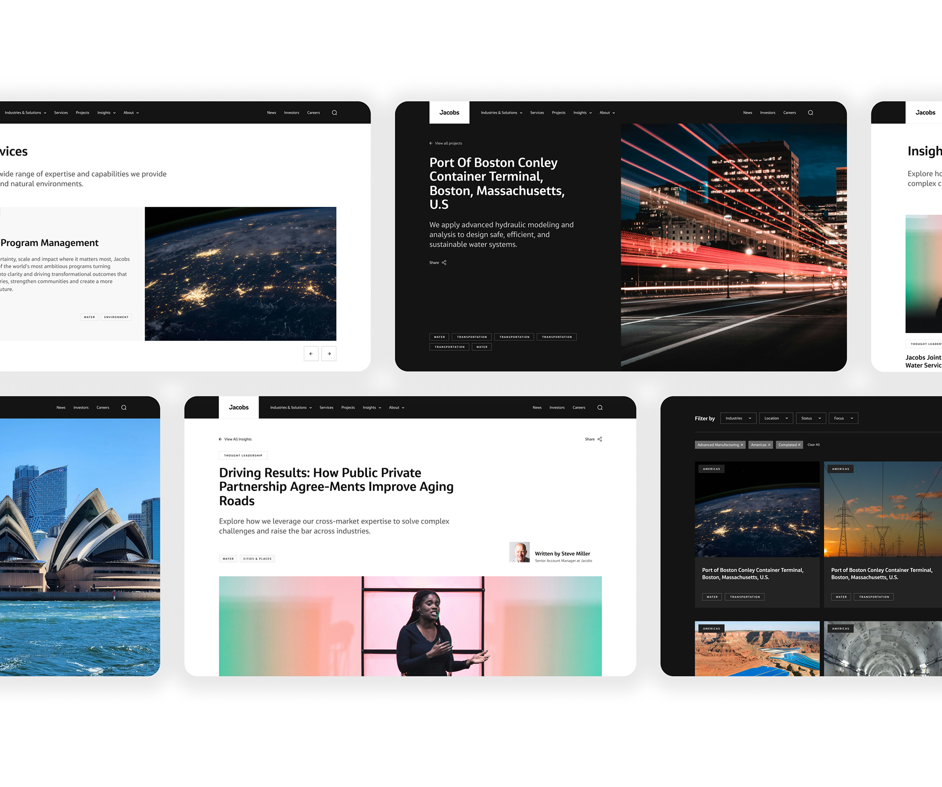
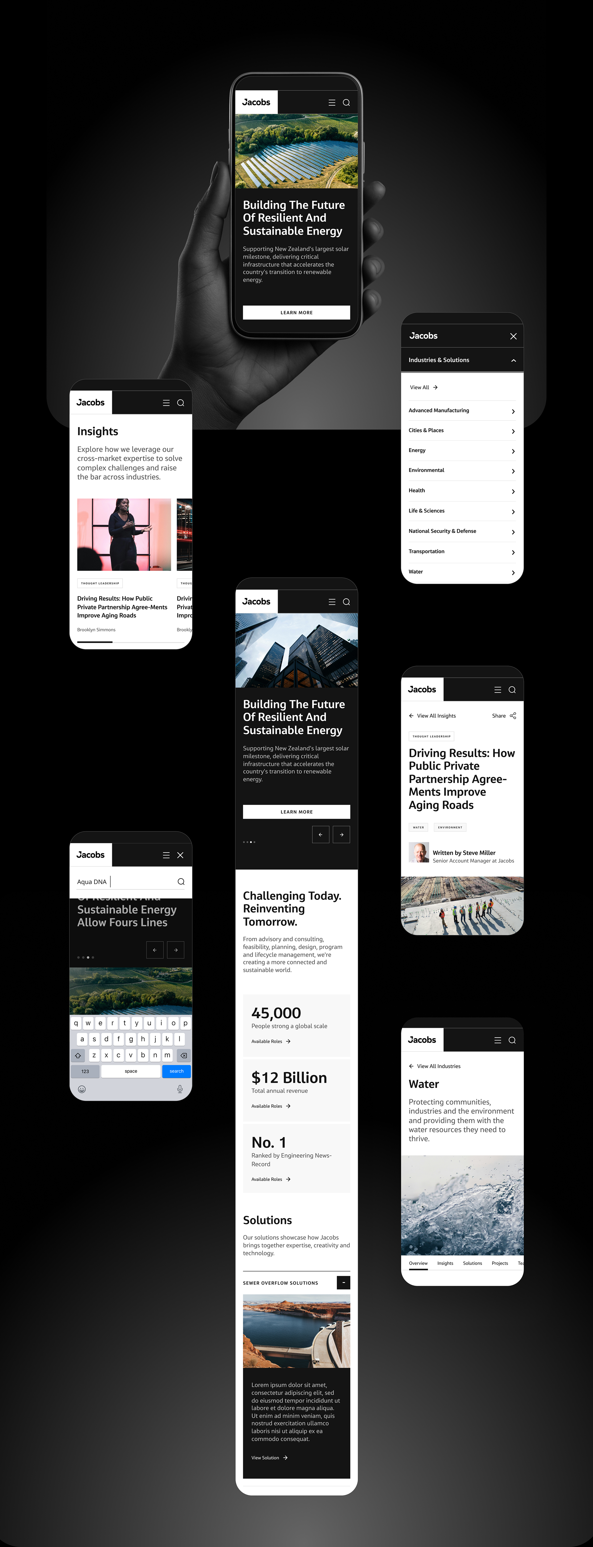
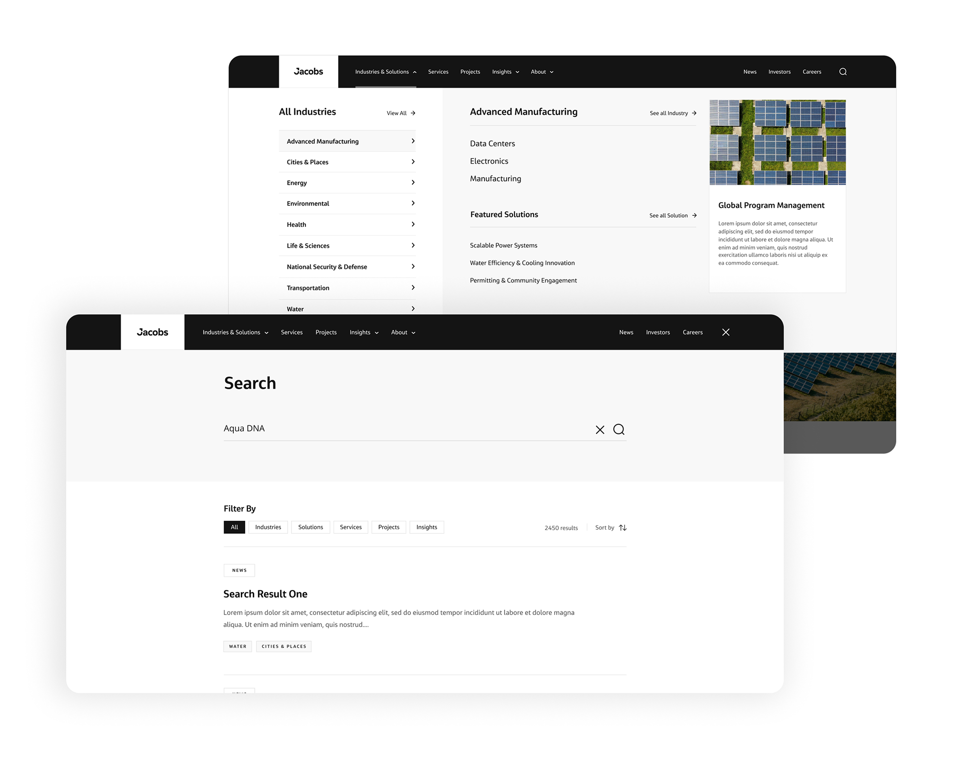
A mega-menu that exposes the full industries-and-solutions taxonomy on demand — every team gets a clear home, without crowding the top level
Modular content patterns so new industries, solutions and services slot into the existing structure instead of forcing redesigns
Region, industry and status tagging across projects and insights, so a growing library stays navigable as it expands
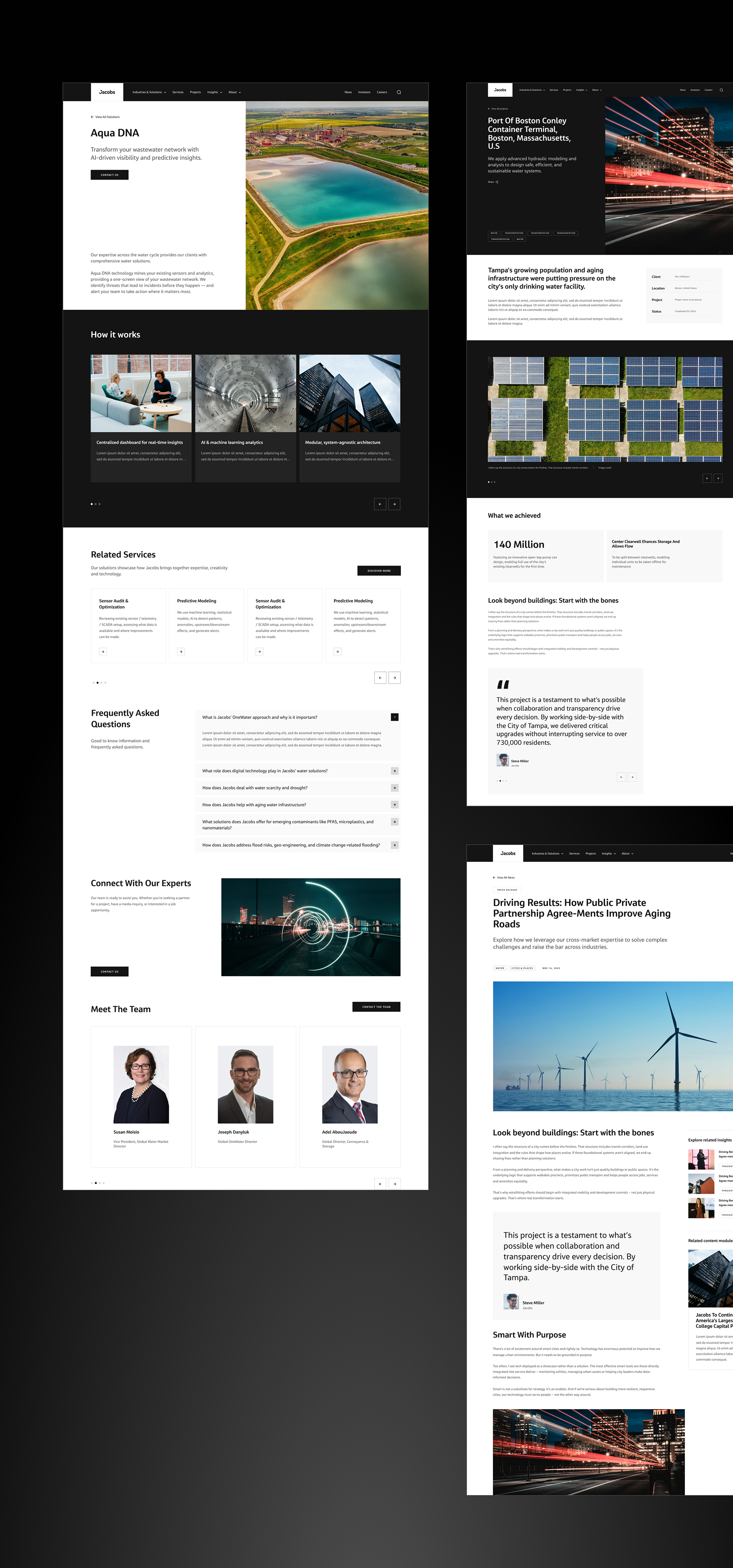
UI Design
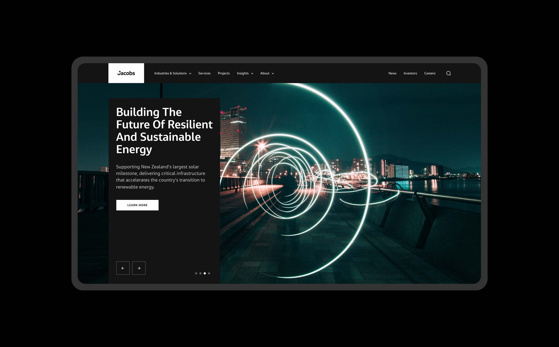
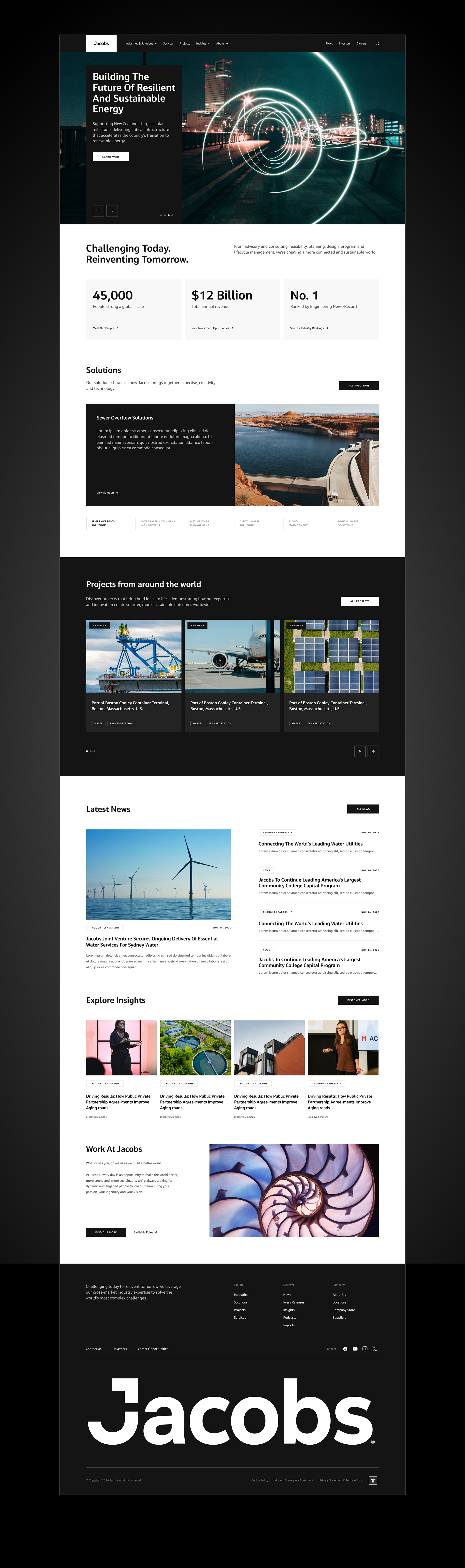
The UI language was built to do two jobs: signal the scale of a $12B firm, and stay consistent in the hands of a large internal team building pages for years. Every section leads with the work, then earns the explanation.
A high-contrast credibility bar — headcount, revenue, ranking — placed before the first scroll to establish authority immediately
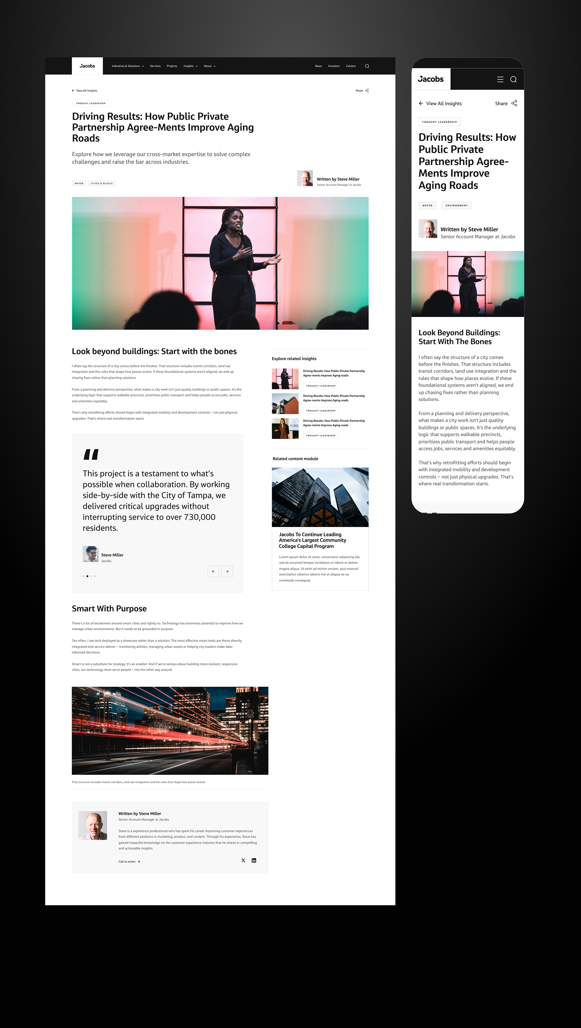
Strong editorial imagery turning a text archive into a scannable showcase
Clearly labelled entry modules (Solutions, Projects, News, Insights, Careers) so each audience self-selects its route from one homepage
A componentised system with defined patterns and states — built so the Jacobs team could assemble new pages on-brand without a designer in the loop
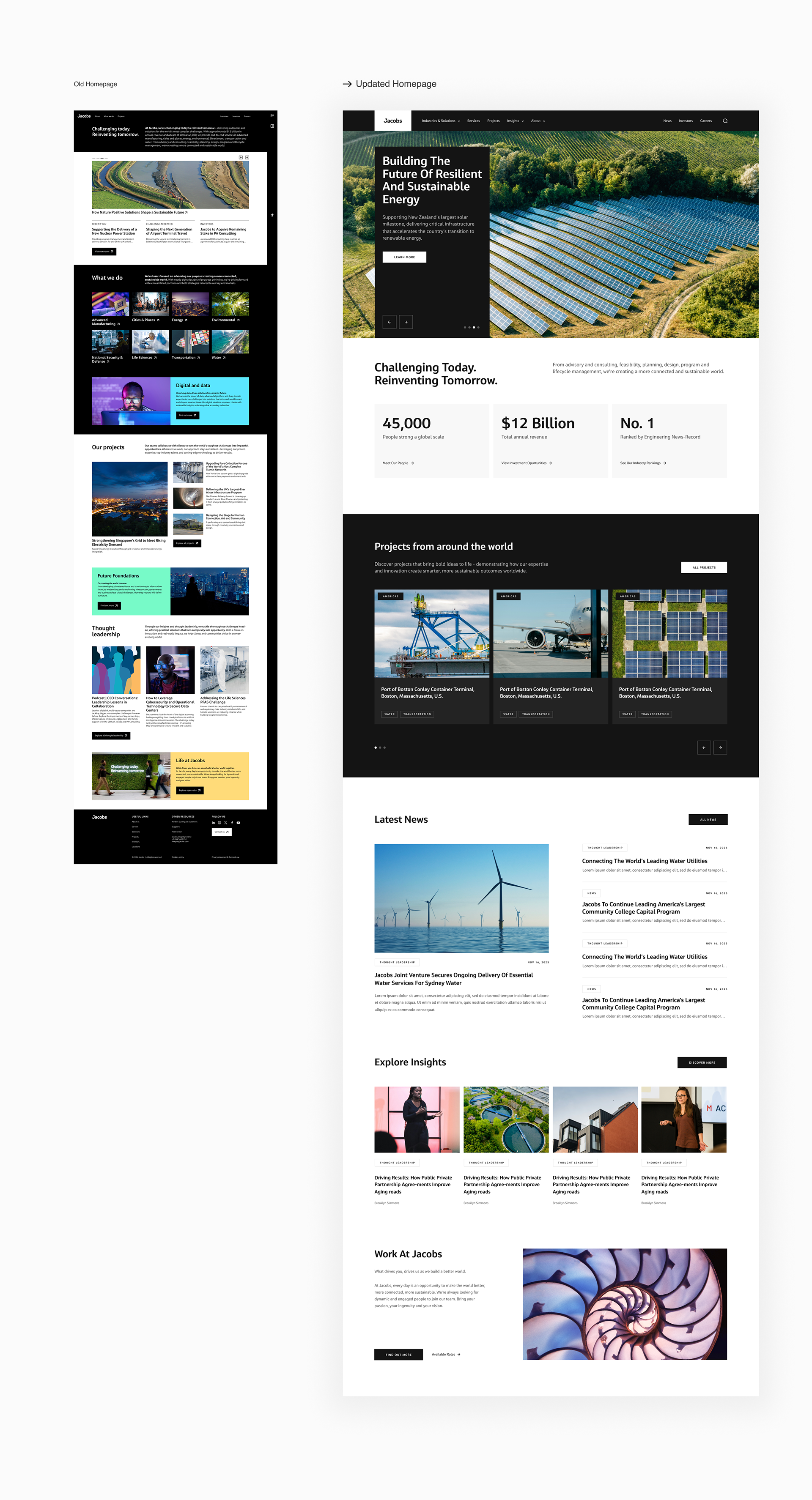
Before / After
The old homepage was a light-grey wall of small type and thumbnail imagery — high traffic landing with no clear entry point. The rebuild trades density for hierarchy: a full-bleed hero, a high-contrast credibility bar, and large editorial project cards. Same depth of content, restructured so a visitor orients in seconds instead of reading to find their way.
Results
A stalled enterprise redesign, unblocked and shipped with a UX direction the business agreed on and a UI system its own team could run with.
A componentised, on-brand UI system built into Drupal designed for a large internal team to build and maintain thousands of pages without a designer gatekeeping every change
An information architecture that gave competing internal stakeholders a fair structure and exposed the firm's full breadth to users
A homepage that establishes $12B-scale credibility in the first screen, giving high traffic a reason to engage
A system proven by use: the architecture and UI language remain in production and have since scaled to carry more industries, nested solutions and a dedicated digital & AI offering — the structure held as the business grew