Enhancing UX and Visual Appeal to Drive Conversions Within Fintech
Prizeout is a payout platform that integrates seamlessly with B2C banking apps such the Bank of America. The platform rewards both customers and employees by offering digital gift cards with additional bonuses. Through banking apps, users can quickly purchase these gift cards using their checking accounts, making the process smooth and efficient. However, to increase conversion rates and boost annual spend, Prizeout sought UX improvements and a more visually appealing interface.
I was tasked with envisioning future iterations of the platform, developing interactive prototypes focusing on optimising the platform’s user experience to drive higher conversion rates.
I was tasked with envisioning future iterations of the platform, developing interactive prototypes focusing on optimising the platform’s user experience to drive higher conversion rates.
My role
CRO / UX Wireframes / UI prototyping
CRO / UX Wireframes / UI prototyping
Site: www.prizeout.com
UX: Creating a Seamless Experience
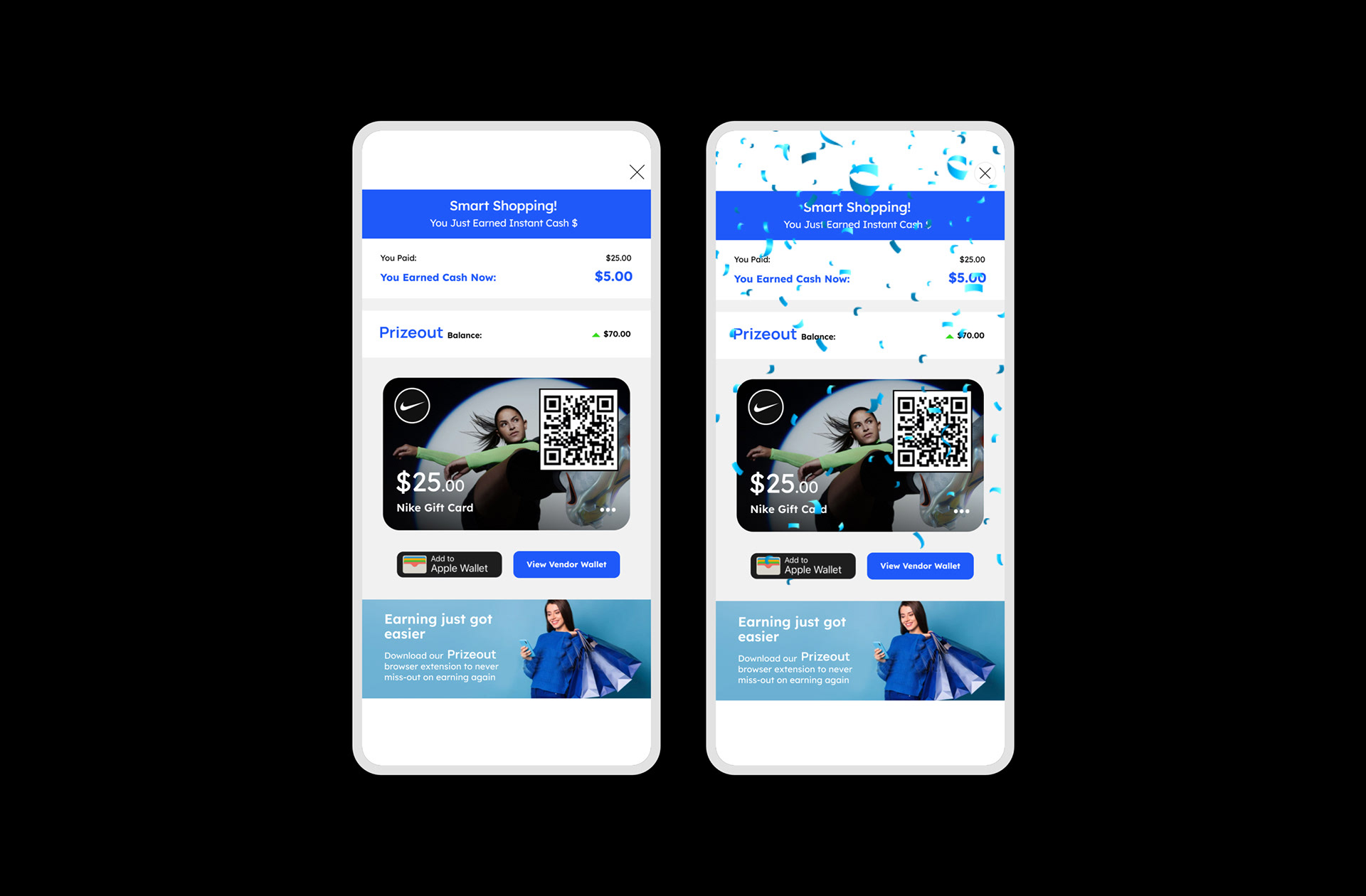
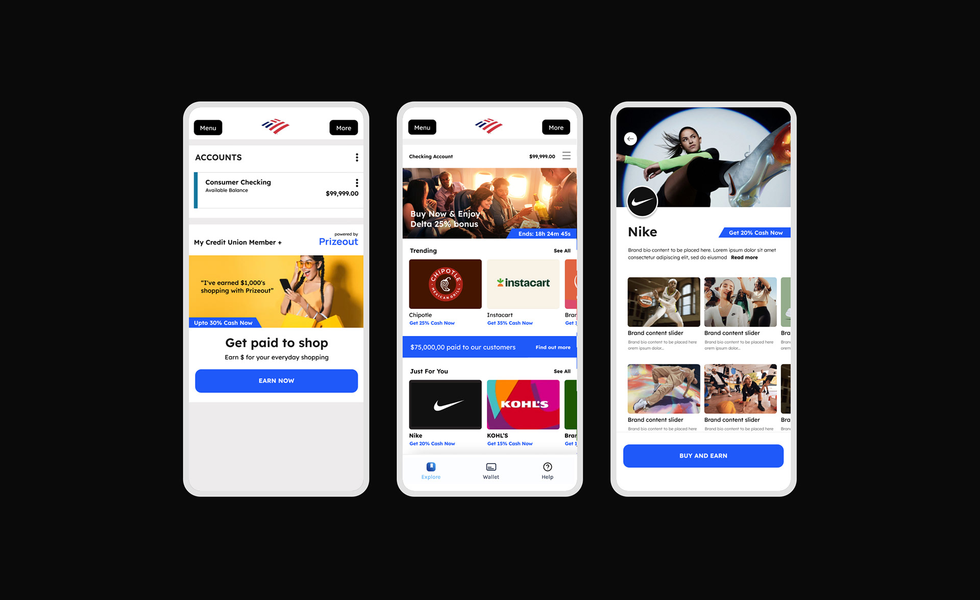
The main objective of the UX improvements was to optimise the user journey, reducing any friction that might prevent users from completing transactions.
Key improvements included:
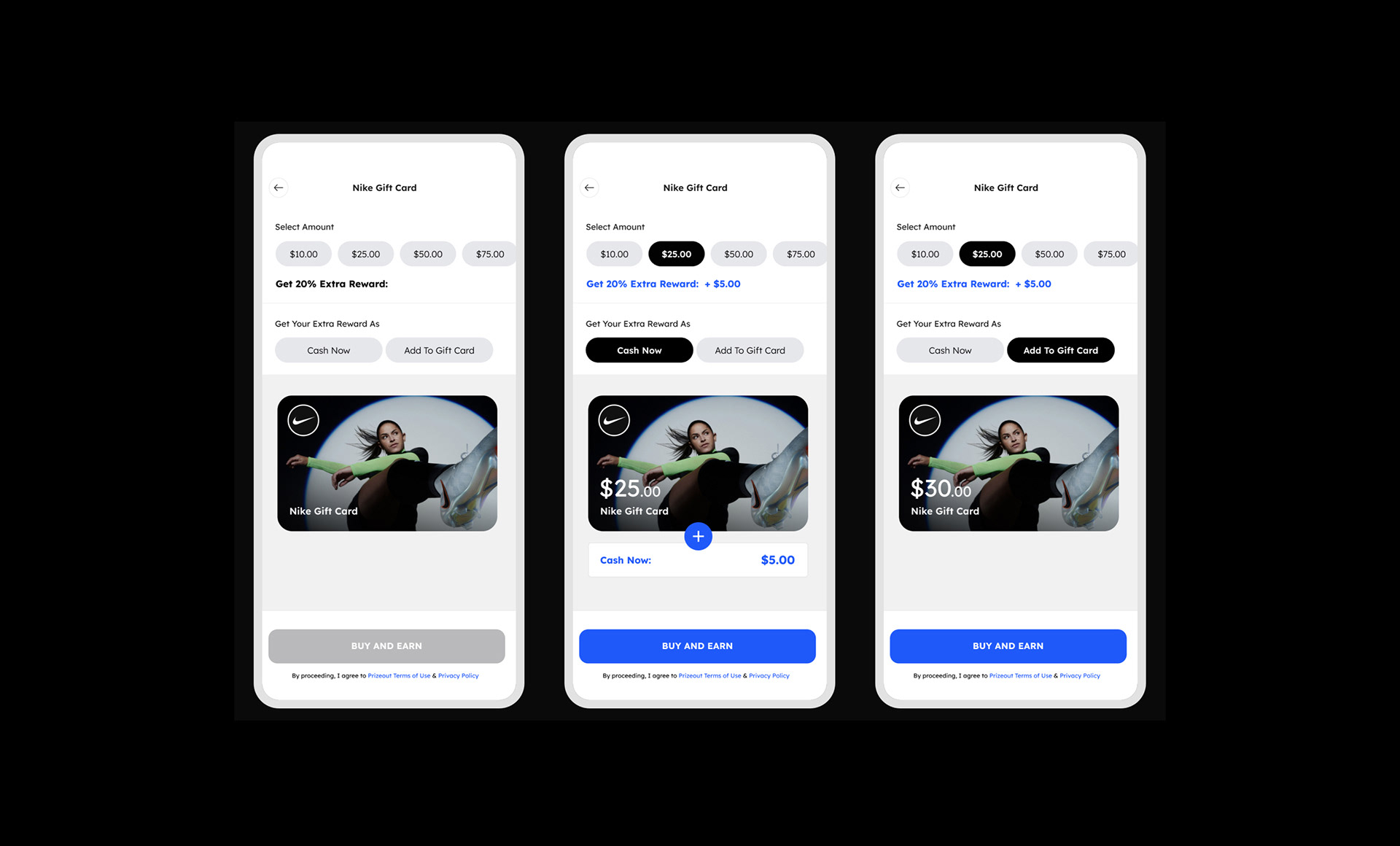
Optimising the Checkout Flow: The current checkout process was streamlined, removing unnecessary steps and ensuring that users could complete transactions faster and with minimal effort. By simplifying forms and making account integration smoother, I reduced potential drop-off points in the purchase journey.
Clarifying Navigation: The platform’s navigation was restructured to ensure that users could easily find the digital gift card options available to them, as well as quickly understand the bonus offers associated with different cards. Key information, such as bonus details and payment options, were made more accessible throughout the user journey.
Feedback Integration: Throughout the design process, I incorporated micro-interaction feedback for buttons and forms, ensuring that they functioned smoothly and were intuitive for users.
Key improvements included:
Optimising the Checkout Flow: The current checkout process was streamlined, removing unnecessary steps and ensuring that users could complete transactions faster and with minimal effort. By simplifying forms and making account integration smoother, I reduced potential drop-off points in the purchase journey.
Clarifying Navigation: The platform’s navigation was restructured to ensure that users could easily find the digital gift card options available to them, as well as quickly understand the bonus offers associated with different cards. Key information, such as bonus details and payment options, were made more accessible throughout the user journey.
Feedback Integration: Throughout the design process, I incorporated micro-interaction feedback for buttons and forms, ensuring that they functioned smoothly and were intuitive for users.
Wireframes and User Journeys: Mapping Out the Experience
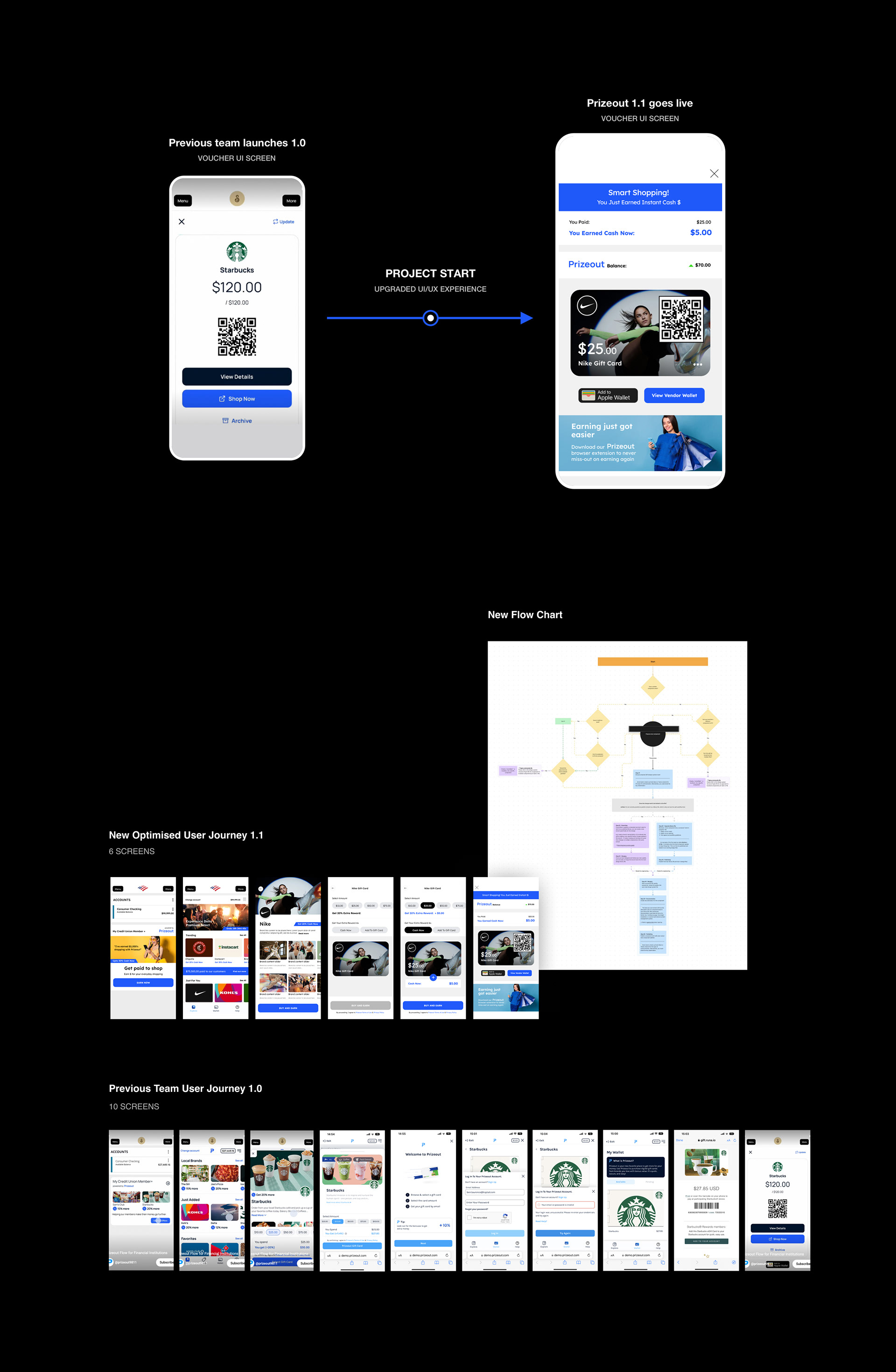
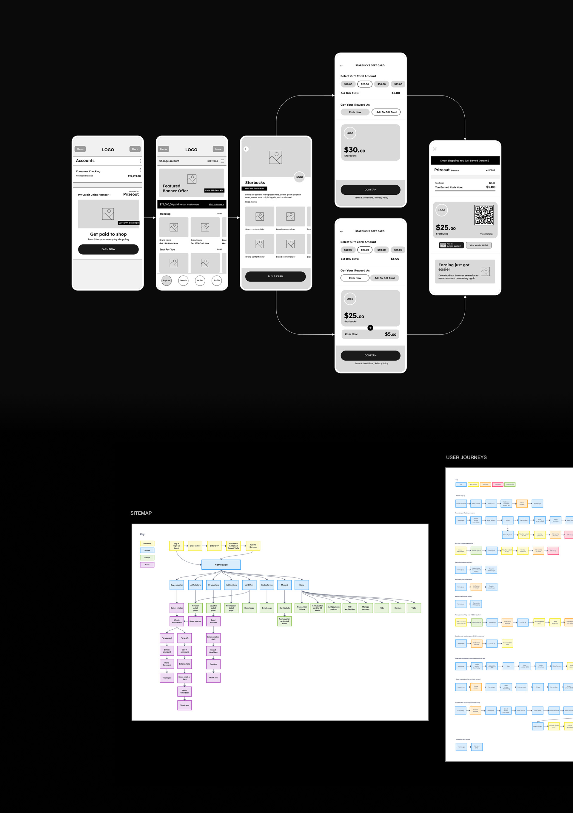
One of the main deliverables for the project was to create wireframes and map user journeys that effectively visualized how customers would interact with the platform. The focus here was on presenting ideas and conceptualizing future improvements.
Wireframes for Presentation: High-fidelity wireframes were developed to clearly demonstrate the flow from start to finish, highlighting key screens such as the homepage, gift card selection, and the checkout process. These wireframes served as a blueprint for stakeholders, showcasing the simplified navigation, streamlined checkout flow, and improved user experience.
User Journey Mapping: The user journey was mapped out in detail, considering the different touchpoints for customers across the platform. These journeys included the path from login to gift card purchase, and the additional bonus incentive journey was highlighted as a critical element in encouraging users to proceed with transactions.
Solid Foundations For Increased Conversion & Engagement
The work done for Prizeout focused on elevating the user experience, simplifying the conversion process, and making the platform visually engaging.
By addressing pain points in the UX and UI, the platform is now better positioned to boost conversion rates and achieve higher annual spending targets.
The wireframes and prototypes developed during this period laid the groundwork for future iterations of the platform, ensuring that Prizeout’s unique payout solution continues to serve users on a high level.
The wireframes and prototypes developed during this period laid the groundwork for future iterations of the platform, ensuring that Prizeout’s unique payout solution continues to serve users on a high level.