
Modernizing a Corporate Site for Growth and Lead Generation in SaaS.
Interaction Metrics helps global brands unlock deeper customer insight through AI-powered, scientifically valid surveys.
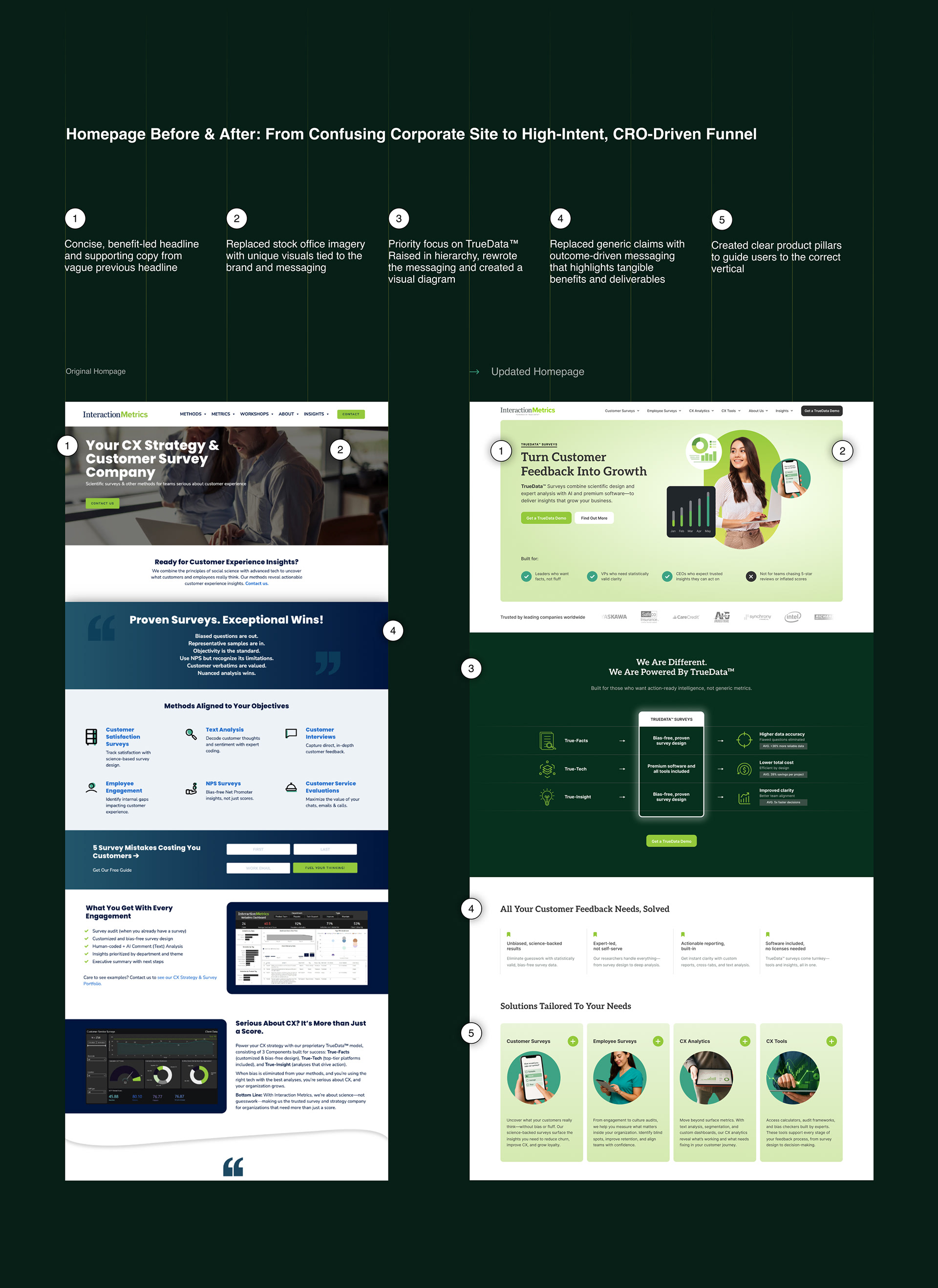
But their site wasn’t doing them justice — confusing structure, vague messaging, and no clear user journey meant missed leads and wasted traffic.
But their site wasn’t doing them justice — confusing structure, vague messaging, and no clear user journey meant missed leads and wasted traffic.
My role
CRO / UX copywriting / UX Wireframes / UI prototyping / Branding / Content Creation
CRO / UX copywriting / UX Wireframes / UI prototyping / Branding / Content Creation
Site: interactionmetrics.com
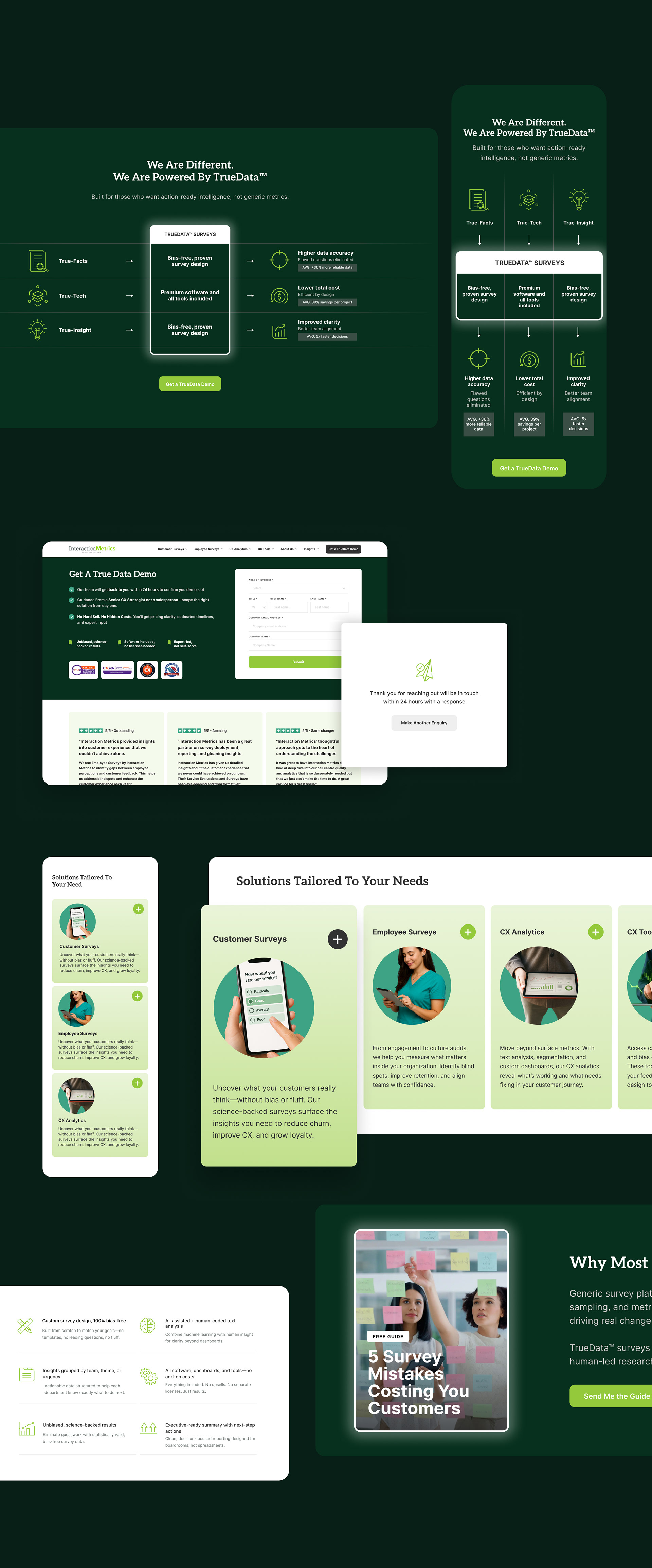
Rebuilding the Experience with Strategic Shift
Key Problem
The old site failed the three-second test — users couldn’t immediately understand the unique offering, why it mattered, or what to do next. Core trust signals were buried. The narrative had no flow. Calls-to-action were disconnected from user intent.
The old site failed the three-second test — users couldn’t immediately understand the unique offering, why it mattered, or what to do next. Core trust signals were buried. The narrative had no flow. Calls-to-action were disconnected from user intent.
CRO Design
We aimed to guide users through a persuasive journey that differentiated Interaction Metrics — not with jargon or noise, but with relevance, proof, and clarity.
We aimed to guide users through a persuasive journey that differentiated Interaction Metrics — not with jargon or noise, but with relevance, proof, and clarity.
To do that, the site needed value proposition copy, lead magnets, trust signals, responsive layouts, and conversion logic.
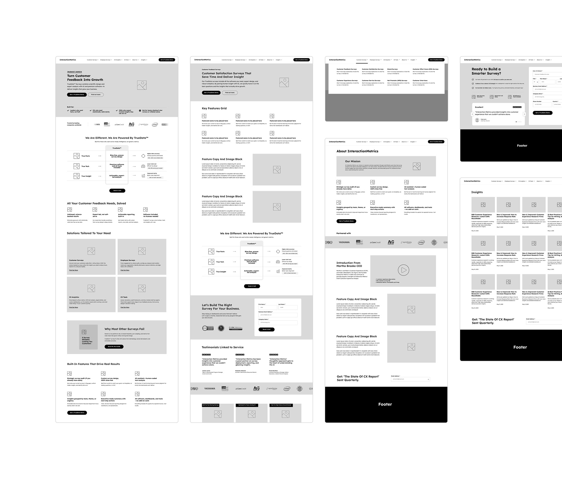
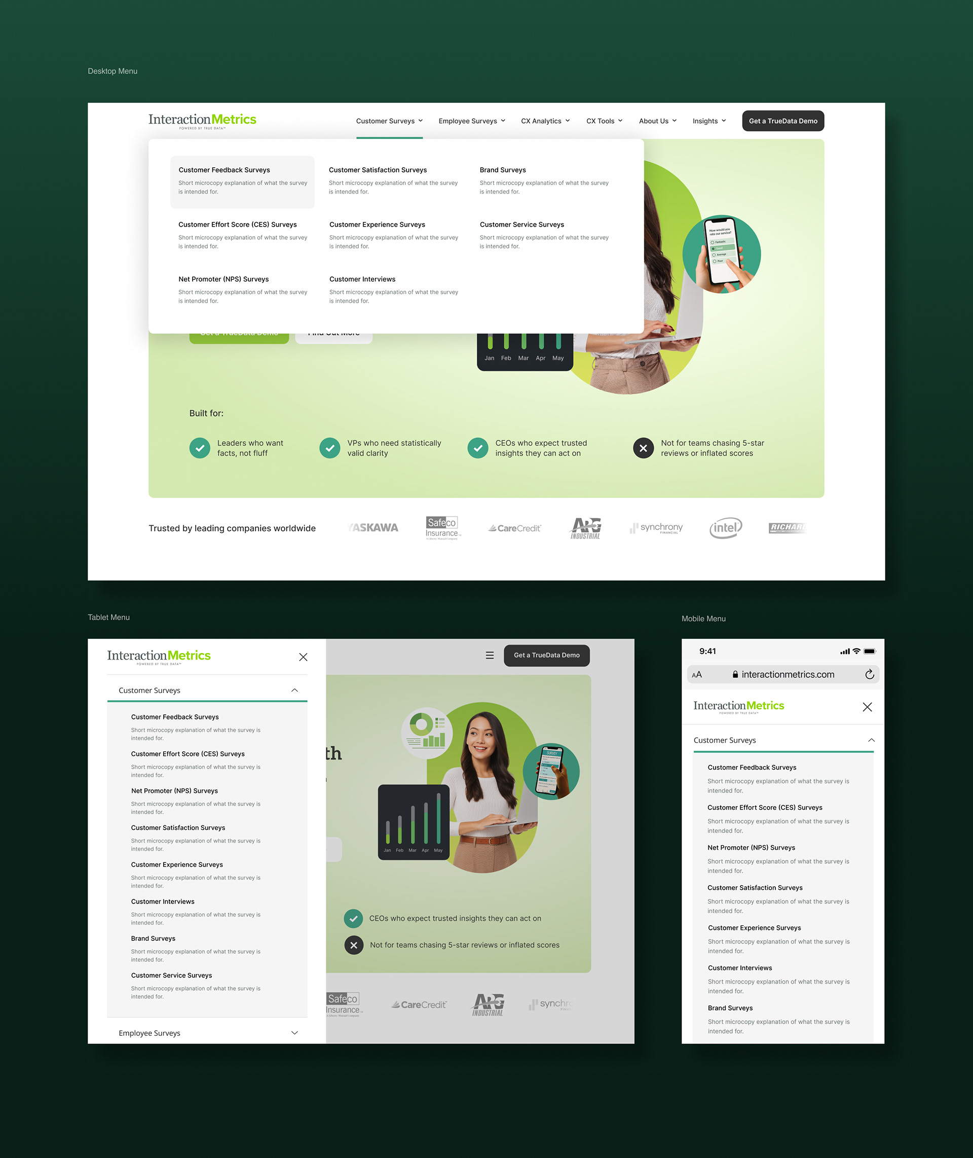
UX & Wireframes to Anchor Strategy
A key objective was to restructure the site to reflect modern SaaS UX standards—simplifying the sitemap, tightening navigation, and guiding users toward high-intent actions.
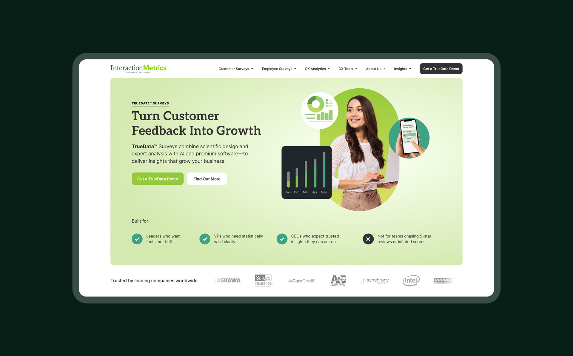
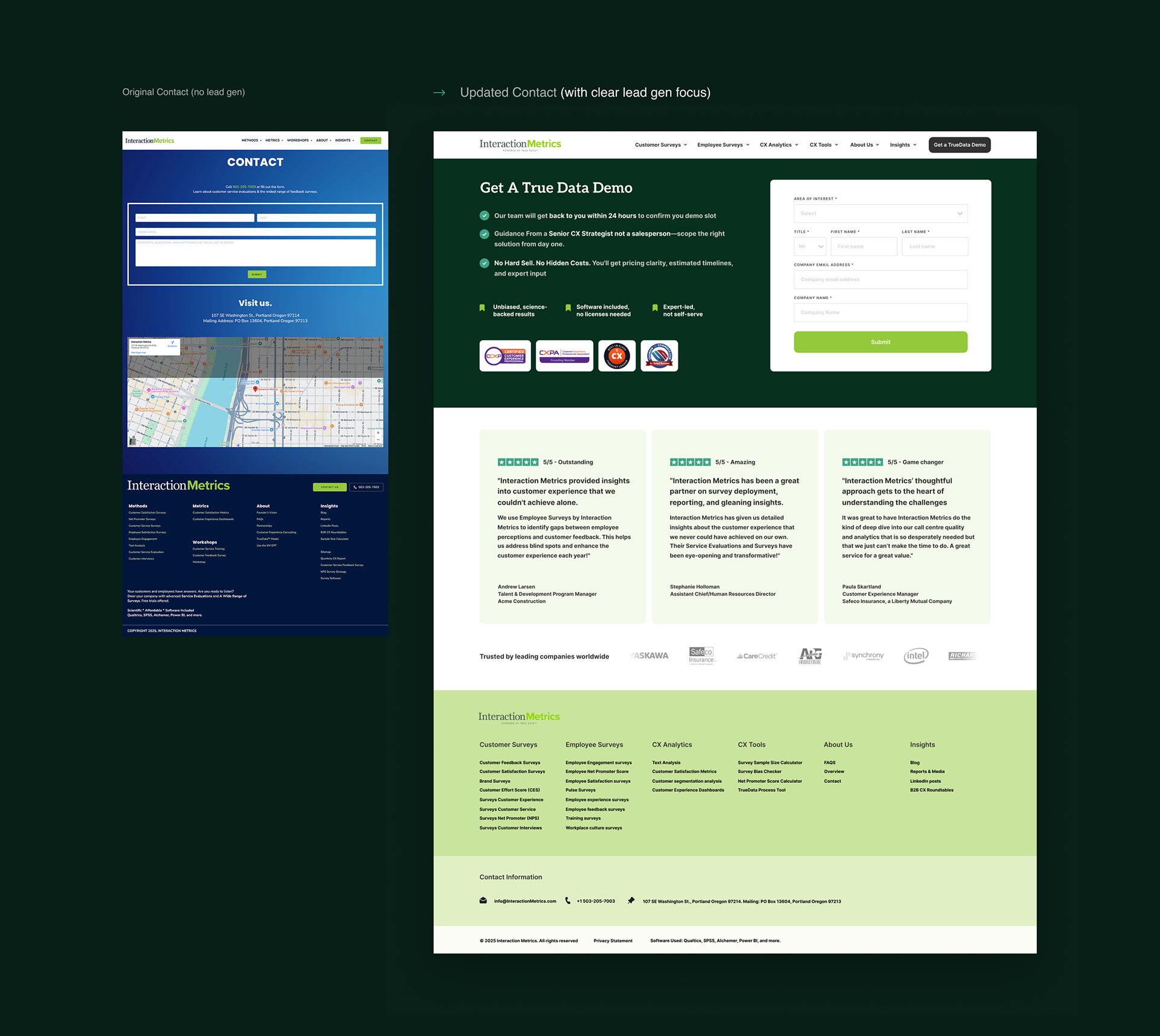
Contact Page: From Static Map to High-Intent Funnel
The original contact page was purely informational: a static form, a map, and zero strategic intent. There was no persuasive copy, no incentive to act, and no structure to guide users toward conversion.
The redesigned page flips the goal from passive contact to active lead generation.
• Clear headline and benefit-driven subcopy make the value of booking a demo obvious.
• A structured, scannable form reduces friction and boosts completion rates.
• Leveraged trust badges, testimonials, and urgency copy reinforce credibility and nudge action.
• The redundant map is gone—replaced with a persuasive UX and a purpose-built funnel.
Not just a visual upgrade—it was a strategic reframe of what the page should do.
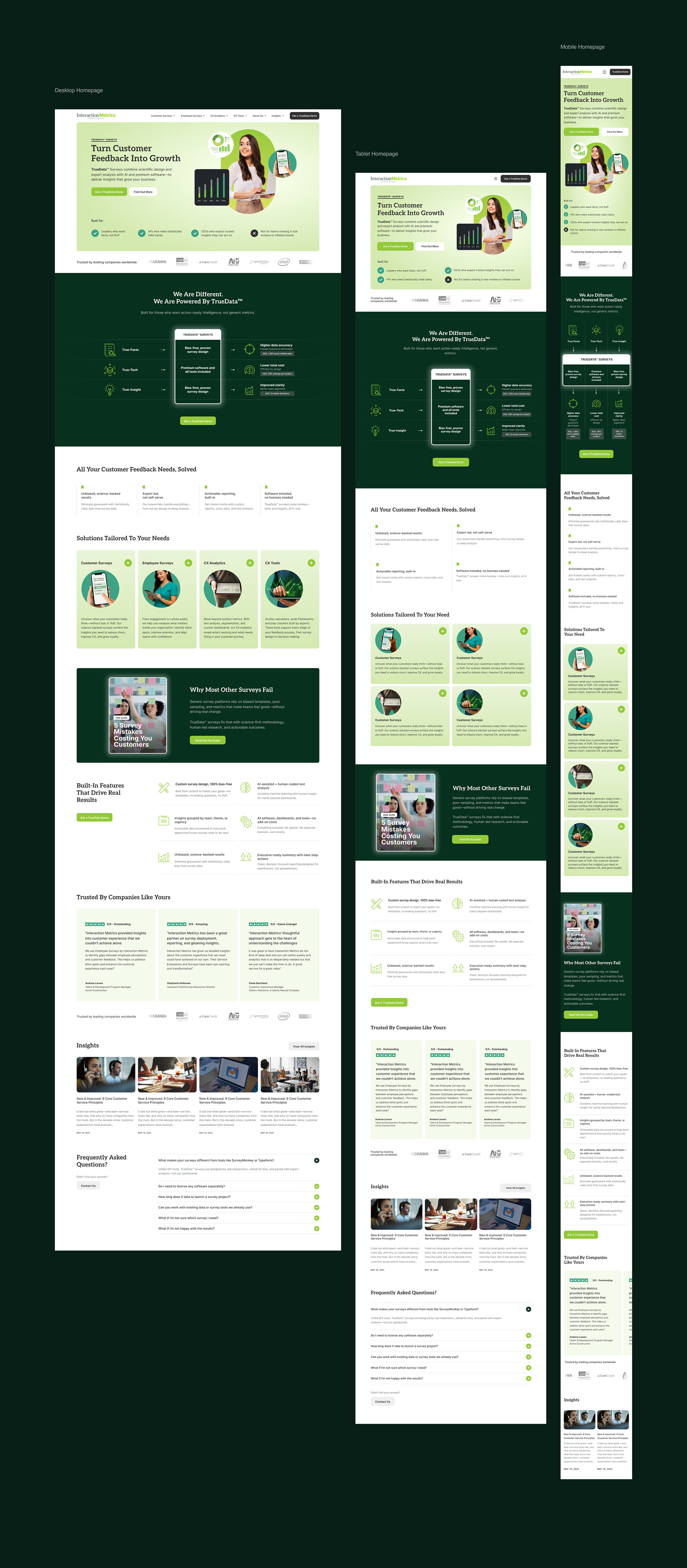
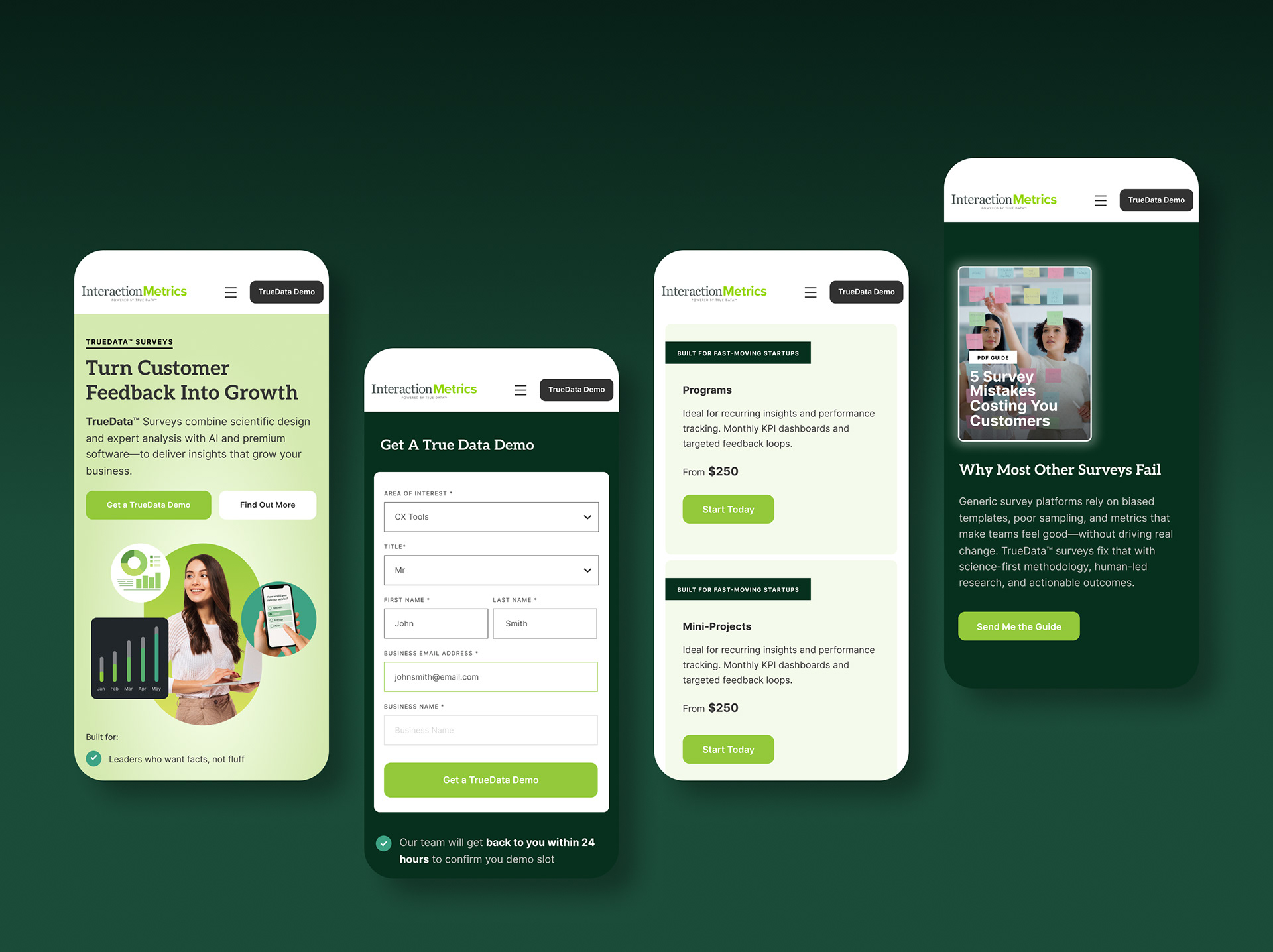
Responsive by Default
This wasn’t a desktop-first project retrofitted for smaller screens. From the beginning, we designed the Interaction Metrics site to be responsive with intent—treating mobile not as a constraint, but as a strategic use case.
Navigation Rebuilt: Simplified for mobile, guiding users to key categories without confusion.
Navigation Rebuilt: Simplified for mobile, guiding users to key categories without confusion.
Content Prioritized: Headlines, CTAs, and value props re-ordered to surface the most persuasive content first.
Mobile-Optimized Forms: Streamlined layout, faster inputs, and inline validation for smoother interaction.
Persistent CTAs: Key actions remain accessible on scroll—especially critical on smaller screens.
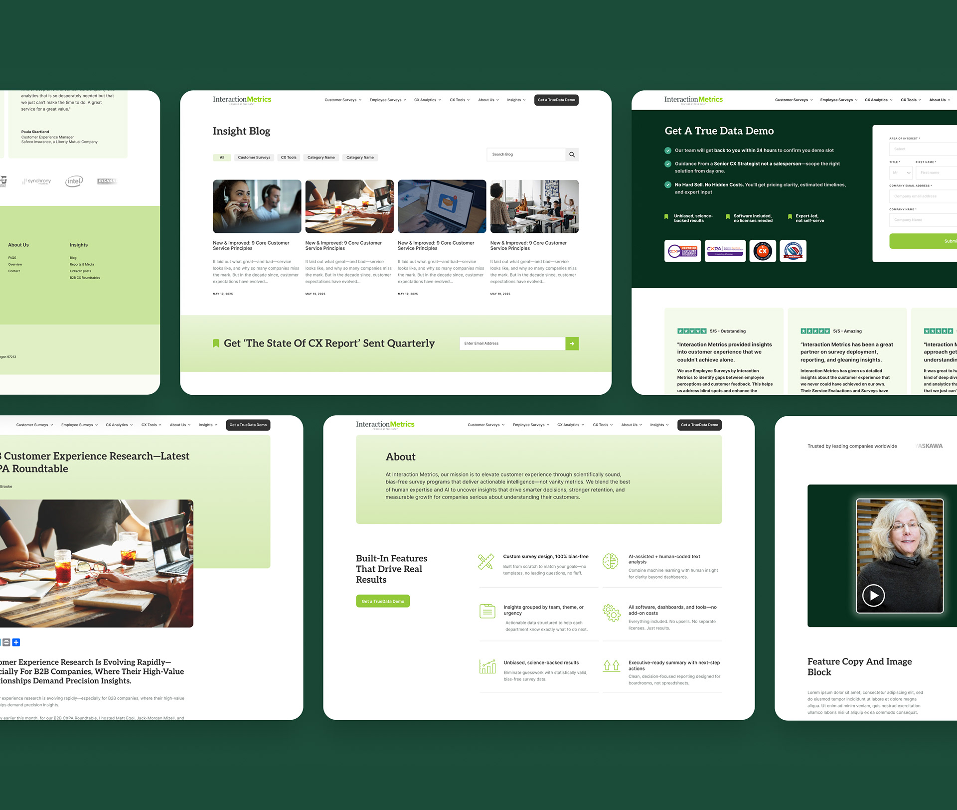
Creating a Digital Identity from Scratch
There was no design system to work from—just a logo and some scattered brand colors. We built the visual identity from the ground up:
• A refined design language with hierarchy, restraint, and logic
• A full custom icon suite to visualize the product stack
• A modernized palette and type system balancing trust and clarity
• Layouts stripped of filler—no more vague graphics or mismatched visuals
What started as a tired B2B site now feels fresh, focused, and credible.
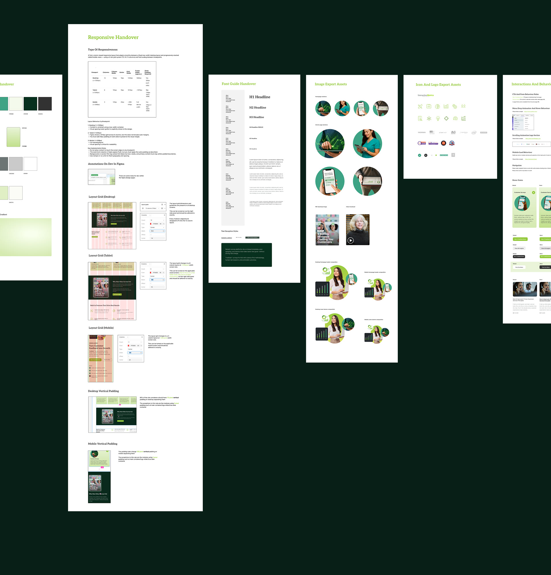
Developer Handover Delivery
To support HTML implementation along with the UI, we created:
• A full visual system with type, color, and icon guides
• Responsive layout rules by breakpoint
• Image export kits and content variants
• Annotated documentation for interaction logic, hover states, and CTA handling
The dev team could build with speed and certainty—no guesswork.
• A full visual system with type, color, and icon guides
• Responsive layout rules by breakpoint
• Image export kits and content variants
• Annotated documentation for interaction logic, hover states, and CTA handling
The dev team could build with speed and certainty—no guesswork.
Final Impact: From Static Site to Scalable Sales Engine
The redesign didn’t just modernize the site — it redefined how Interaction Metrics sells online.
With clearer messaging, a conversion-structured layout, and targeted lead magnets, the site now guides users from confusion to conversion, increasing engagement, lead quality, and user confidence.