Designing Clarity for a Complex
E-commerce Product
E-commerce Product
Beuta: A modular garden brand with high performance across years, strong reviews, and a product that genuinely delivers.
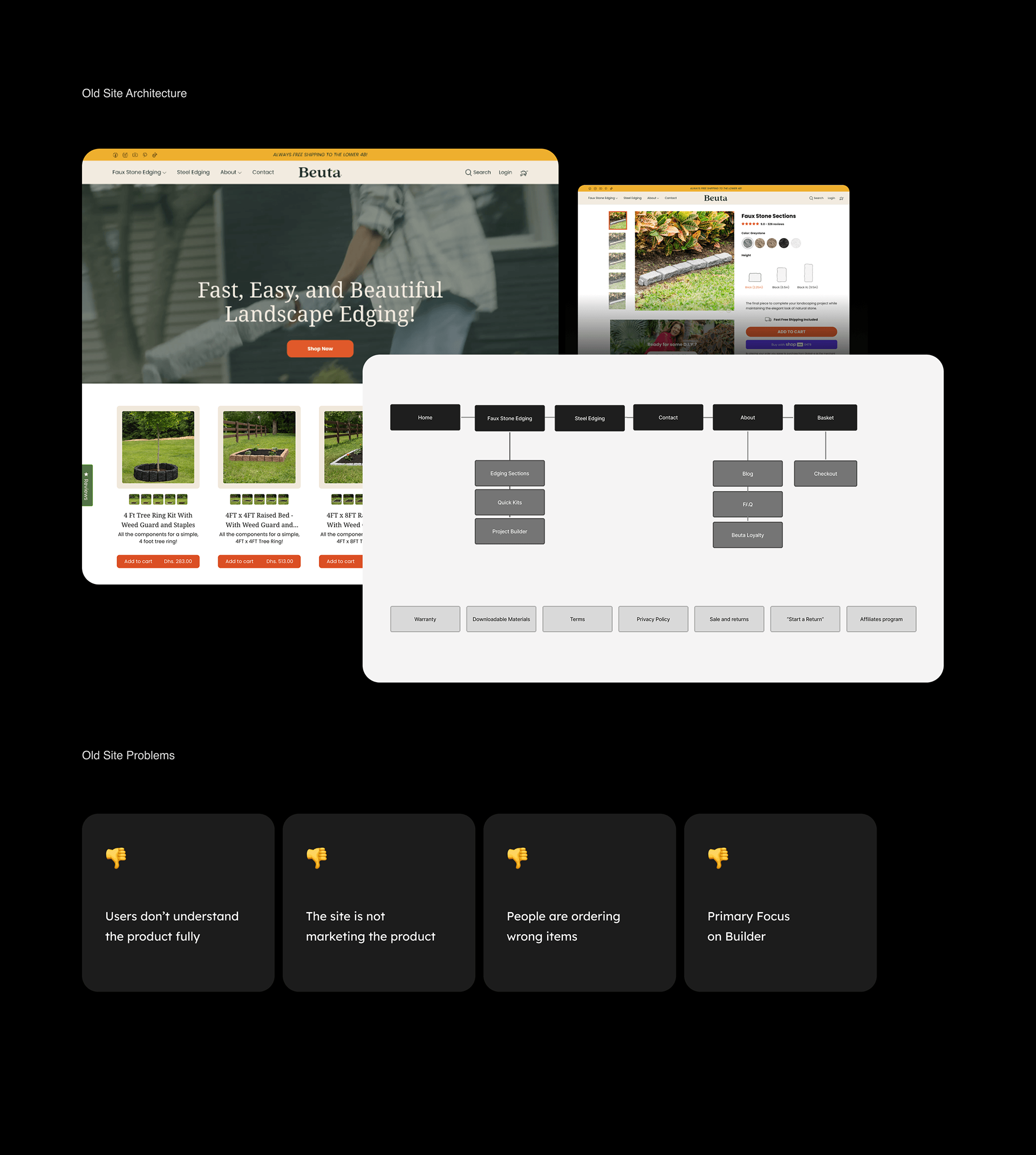
The old site wasn't keeping pace with where Beuta was headed. A Project Builder that wasn't converting. A structure that confused first-time buyers and generated wrong orders. And a UI that looked like the starting point, not the destination.
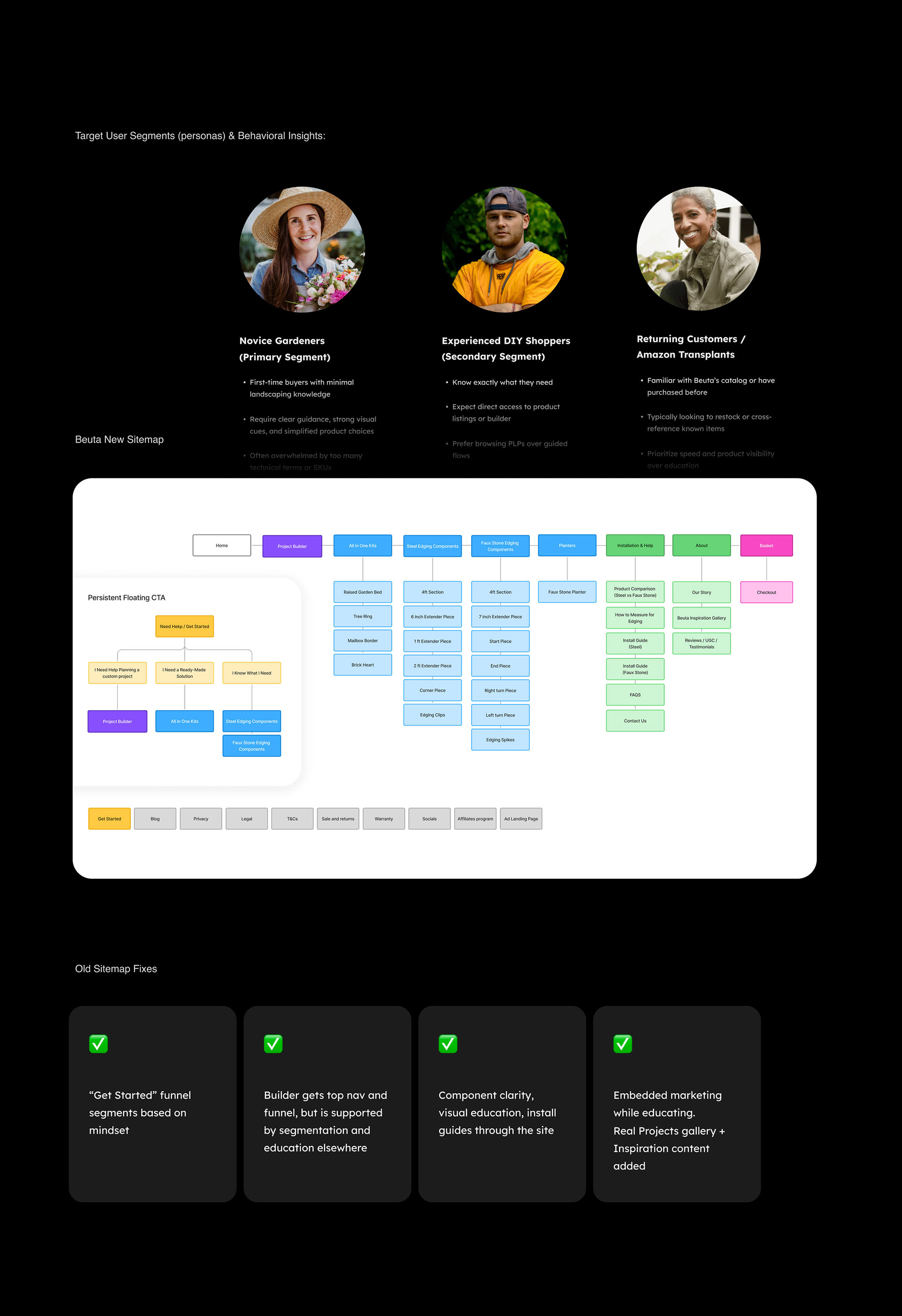
We rebuilt from the ground up, clarify the brand identity, fix the structural issues that were costing them customers, and turn a good product into a site experience that could match its ambition.
The old site wasn't keeping pace with where Beuta was headed. A Project Builder that wasn't converting. A structure that confused first-time buyers and generated wrong orders. And a UI that looked like the starting point, not the destination.
We rebuilt from the ground up, clarify the brand identity, fix the structural issues that were costing them customers, and turn a good product into a site experience that could match its ambition.
My role
UX Architecture / Information Architecture / Sitemap & Navigation / Wireframes / CRO Strategy / UI Consultancy
Site: www.beuta.com
UX Architecture / Information Architecture / Sitemap & Navigation / Wireframes / CRO Strategy / UI Consultancy
Site: www.beuta.com
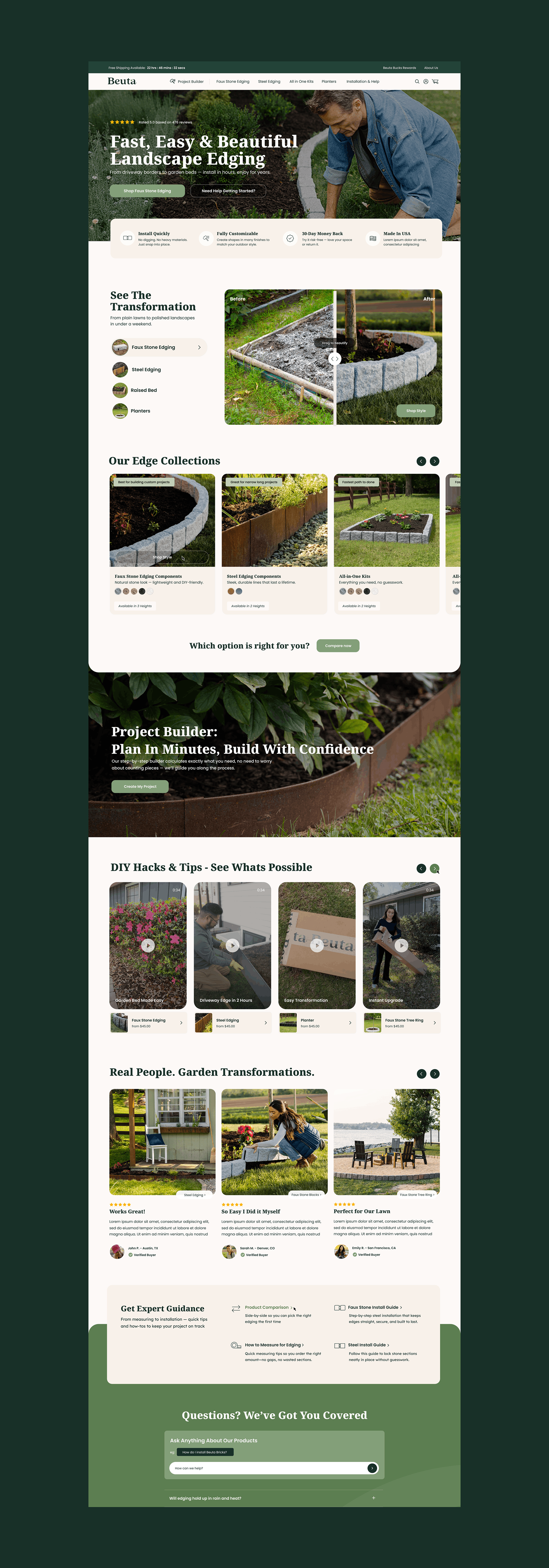
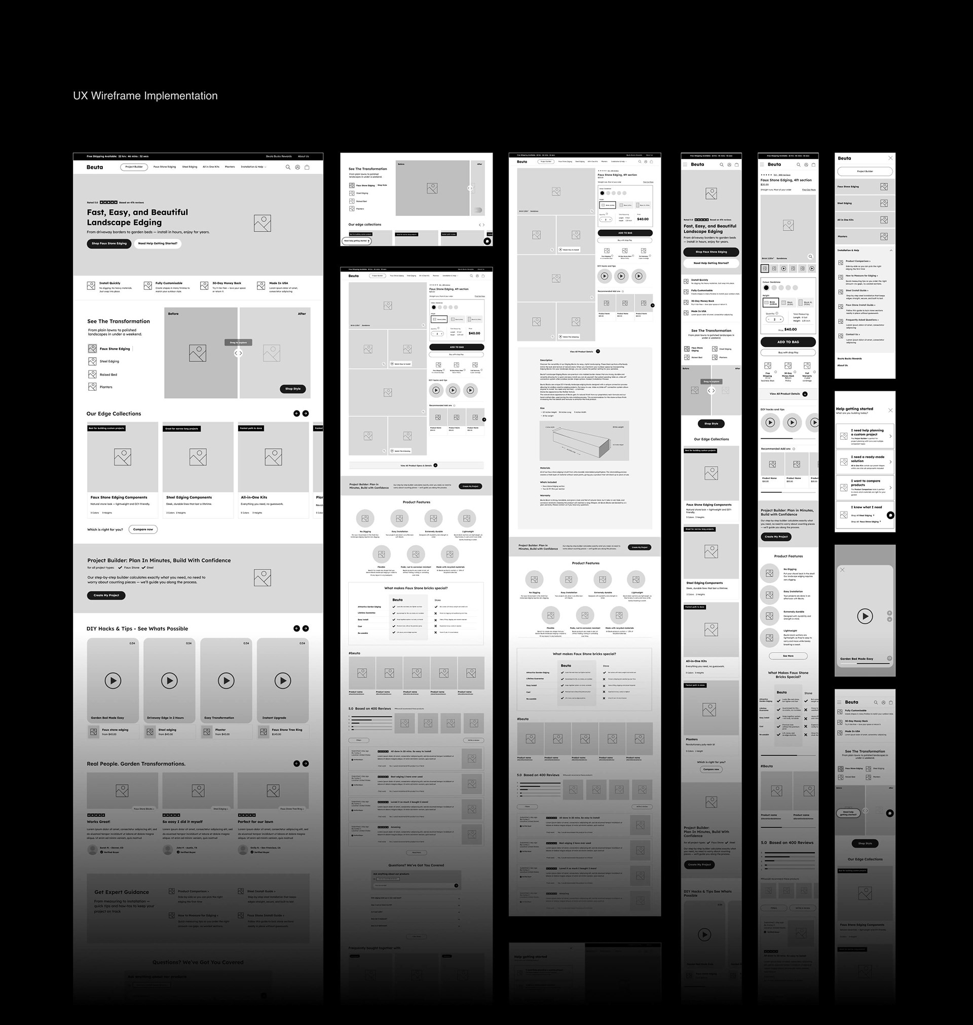
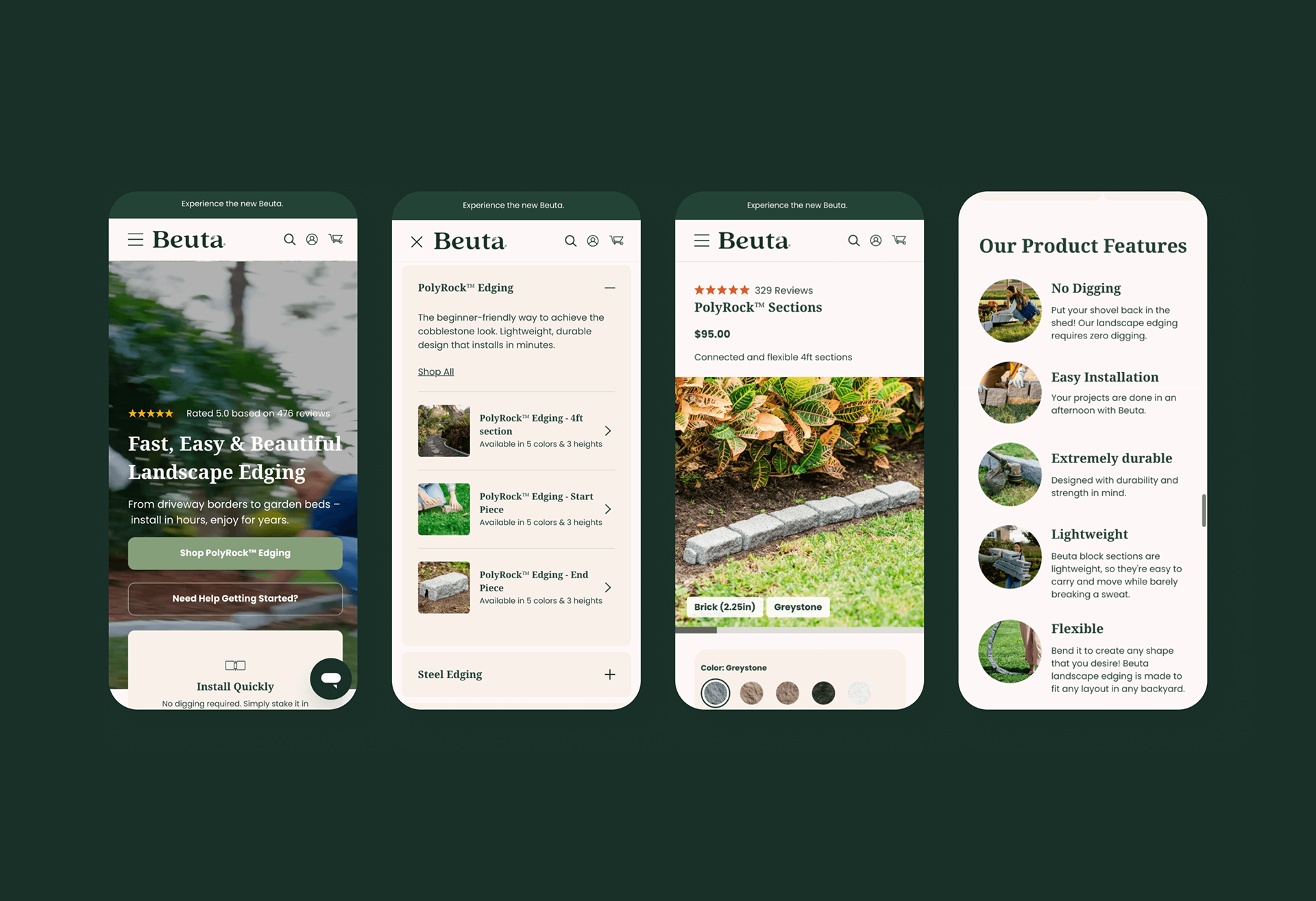
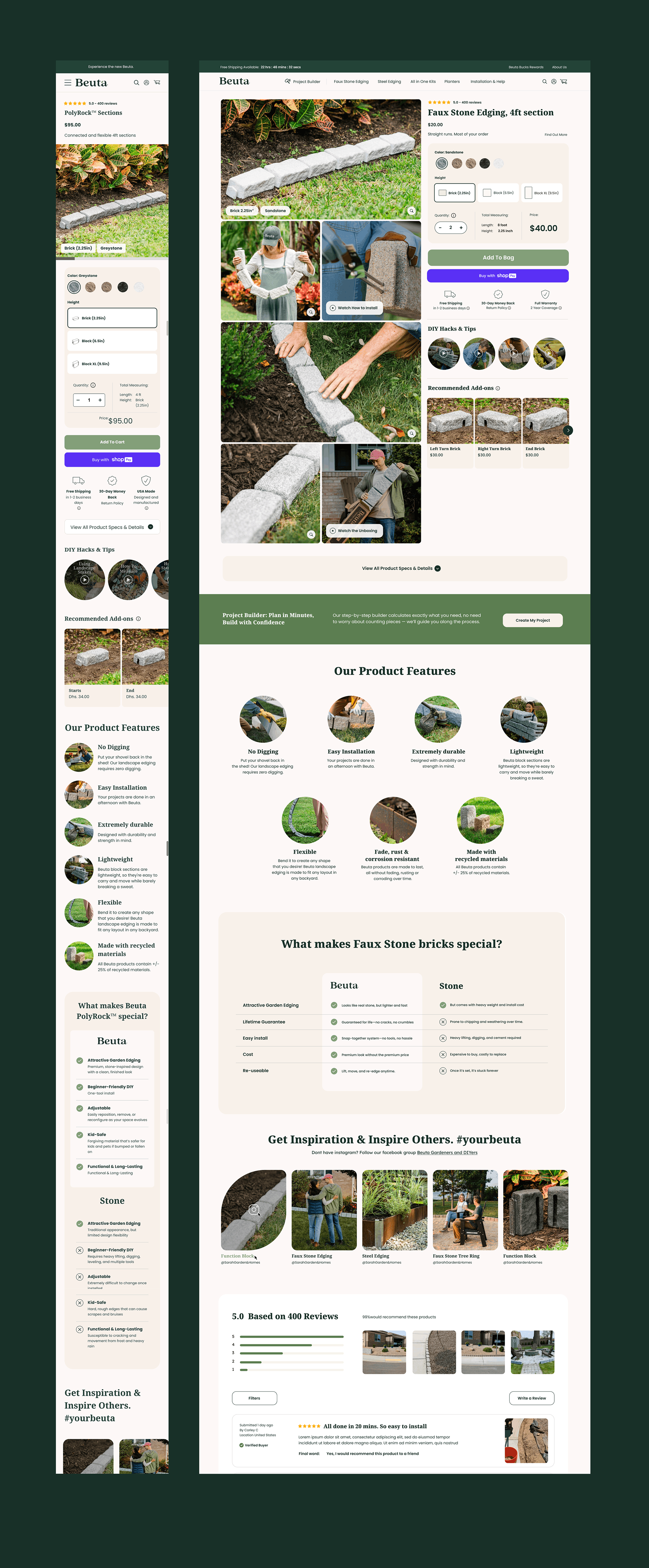
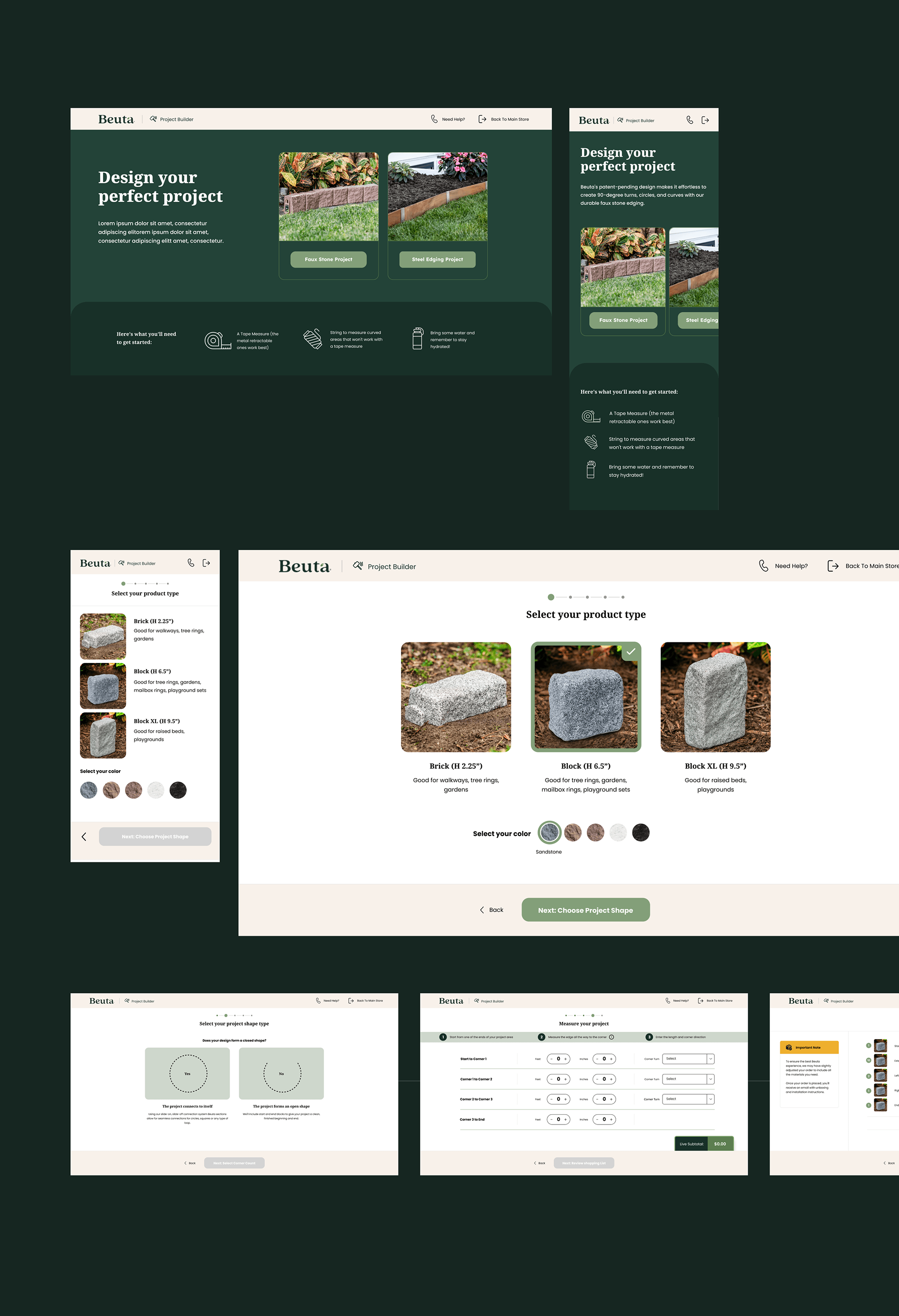
Wireframes: Conversion Logic Built Into Every Template
Full wireframe coverage was produced across all primary page templates, with CRO rationale embedded directly into layout and annotation.
• Homepage structured to establish product clarity and route users into their correct journey within the first scroll
• PLP (Product Listing Pages) with filtering logic designed to reduce SKU overwhelm without hiding range depth
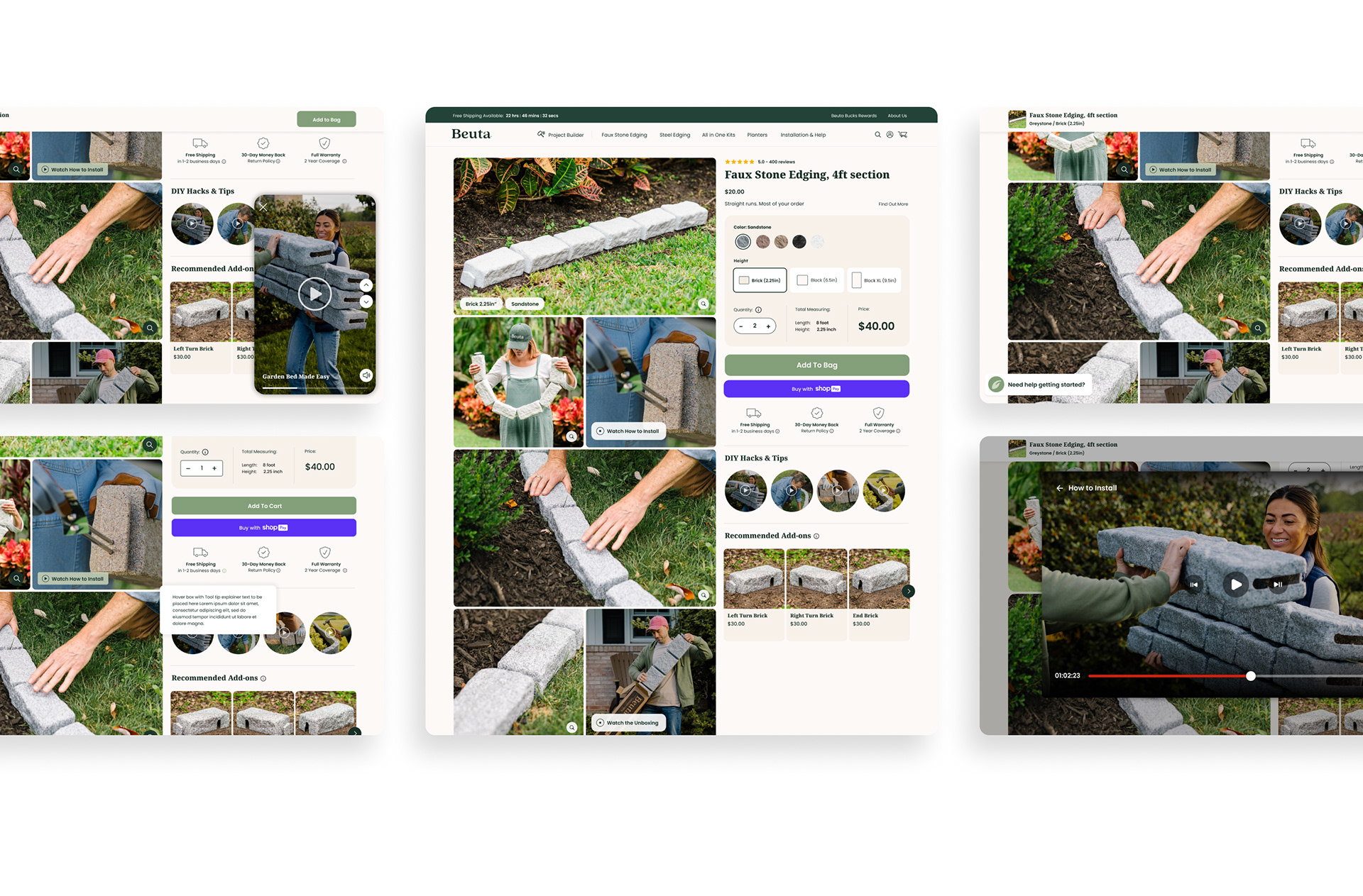
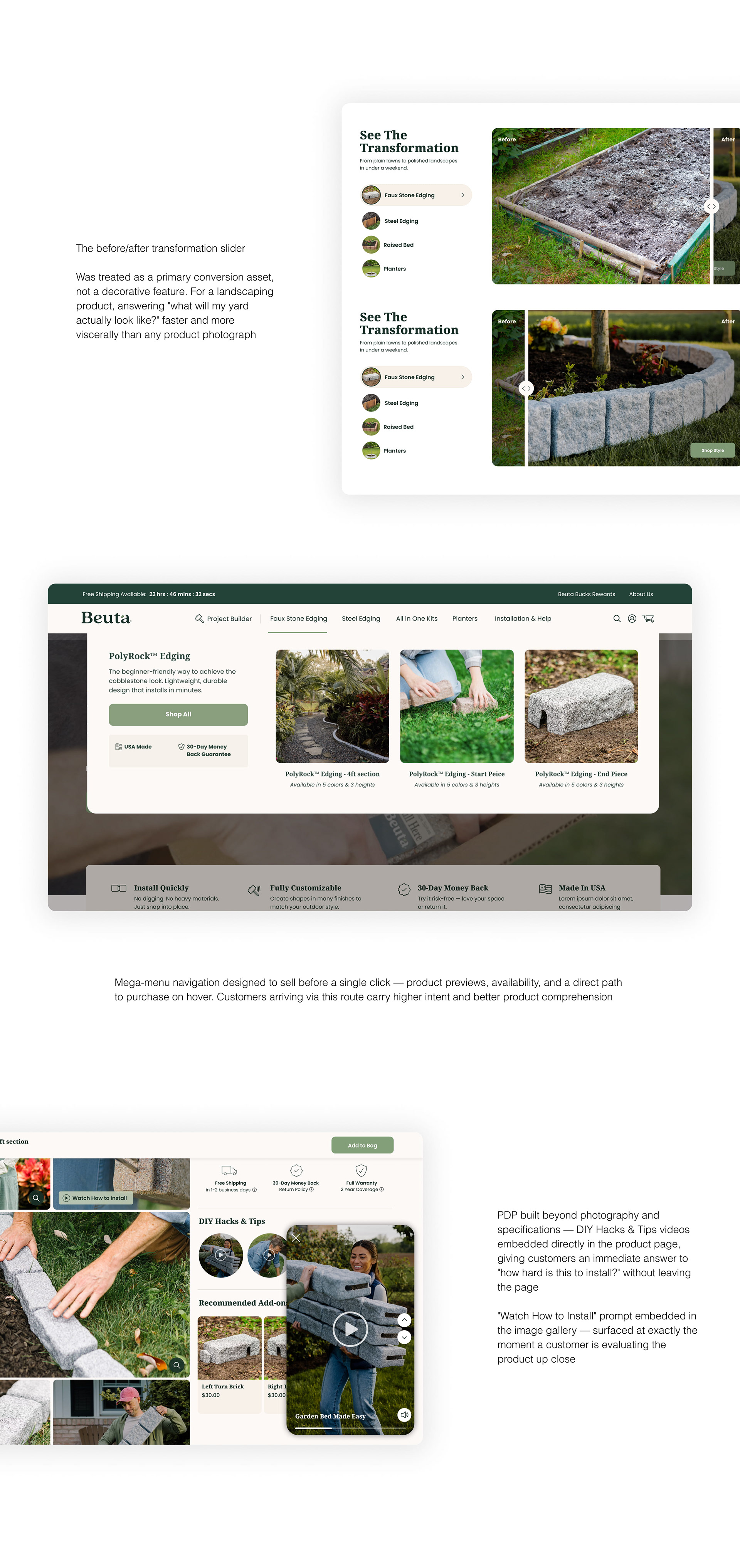
• PDP (Product Detail Pages) built with embedded education — measurement guidance, material context, and upsell logic positioned at the moment of decision, not as separate pages
• Builder funnel flow wireframed to integrate naturally from both homepage and PDP entry points
• Cart and checkout reviewed for drop-off friction, with CTA and copy direction built directly into annotations
• Every wireframe delivered as a complete handoff document — not a layout skeleton requiring interpretation by the development team
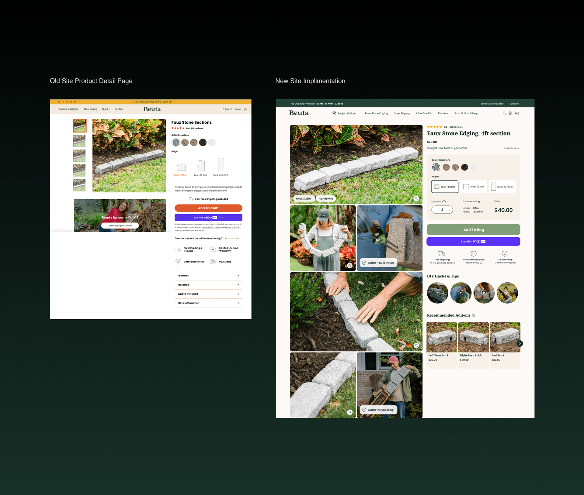
UI Design: Every Decision Connected to a Commercial Outcome
The UI was designed to make the product understandable before a buyer commits — and to eliminate the hesitation points that were driving wrong orders and abandoned carts.
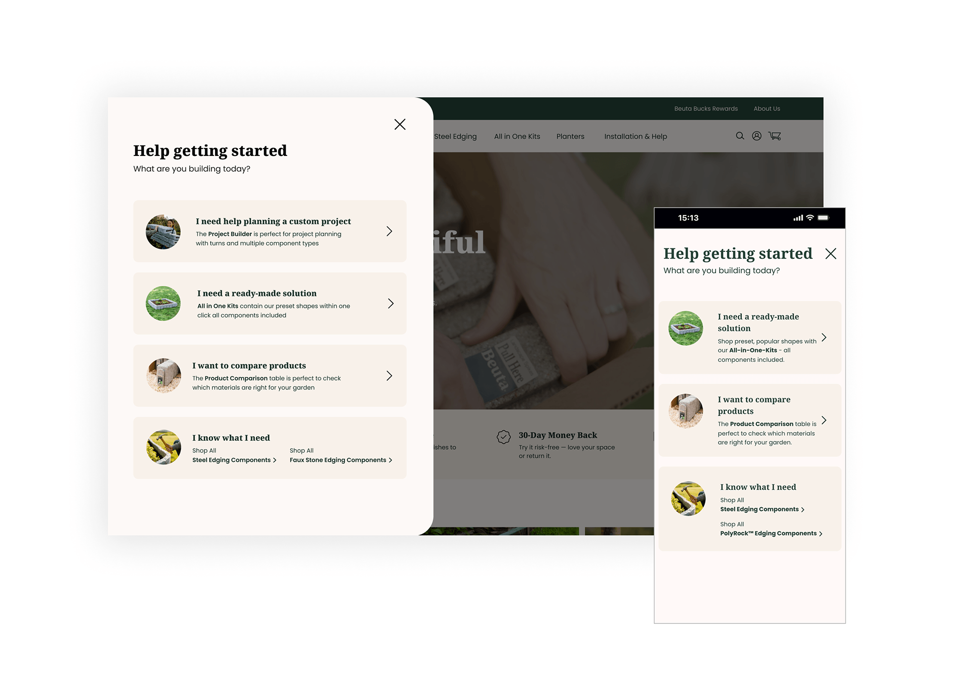
Help Getting Started: The Feature That Removes the Biggest Barrier to Purchase
One of the most considered features of the redesign is the Help Getting Started module — a persistent, on-demand guide that meets customers exactly where they are in their journey.
Rather than presenting a single path to purchase, it opens with a simple question: What are you building today?
Four distinct routes branch out from there. For a modular product with multiple configurations and component types, this removes the single biggest barrier to purchase — not knowing where to start. Every visitor, regardless of knowledge or intent, lands somewhere relevant within seconds.
Client testimonial
"Ben was an awesome partner on our new site. He handled the UX, design, and project builder, and really took the time to understand what we wanted.
He worked quickly, was easy to collaborate with, and stayed closely aligned with our dev team the whole way through.
The final result came out exactly as we envisioned: clean, intuitive, and high-performing. Highly recommend working with him"
Kyle Yeager
Digital Director Beuta
He worked quickly, was easy to collaborate with, and stayed closely aligned with our dev team the whole way through.
The final result came out exactly as we envisioned: clean, intuitive, and high-performing. Highly recommend working with him"
Kyle Yeager
Digital Director Beuta
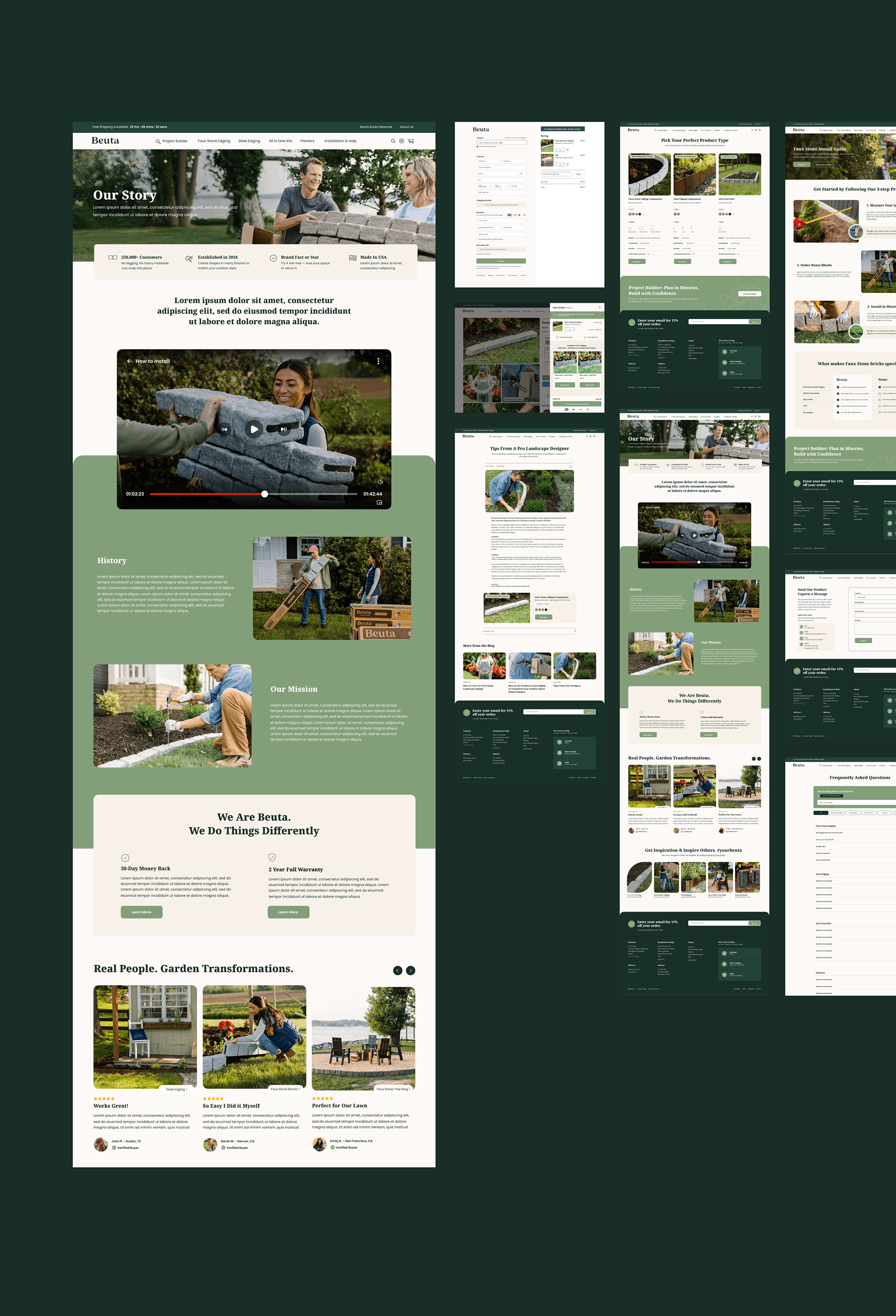
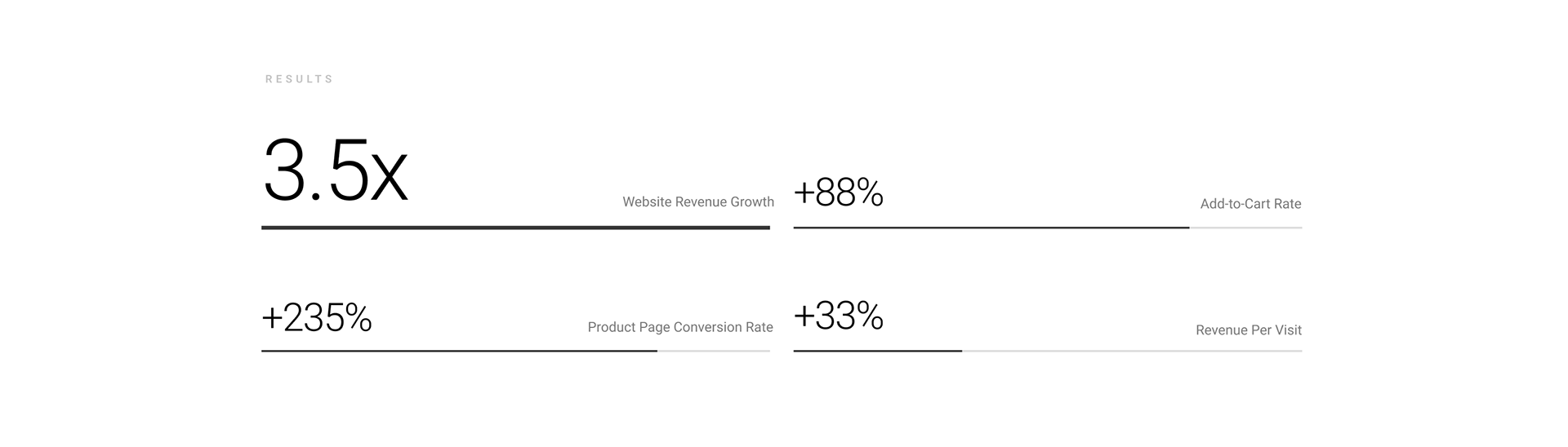
What This Delivered
The site now balances education and conversion, helping first-time buyers understand what they need while allowing experienced customers to move quickly to purchase.
By restructuring navigation, simplifying decision points, and embedding support directly into the buying journey, the platform is designed to reduce friction, minimise ordering errors, and scale as the product range grows. Rather than relying on a single flow, the site supports multiple buying mindsets within one cohesive system, creating a stronger foundation for future optimisation, testing, and growth.
By restructuring navigation, simplifying decision points, and embedding support directly into the buying journey, the platform is designed to reduce friction, minimise ordering errors, and scale as the product range grows. Rather than relying on a single flow, the site supports multiple buying mindsets within one cohesive system, creating a stronger foundation for future optimisation, testing, and growth.